Off the back of the Athena Experimentation Squad work, the Native team saw an opportunity to improve the mobile experience for users visiting their hearing aids advertorials. They invited me to attend an ideation session to help come up with solutions, and then to design the chosen solution.
Mobile conversion rate was approximately 40% lower for mobile devices compared to desktop. A key contributor to this was the year of birth call-to-action component which appeared on advertorials in the UK, the US and Canada. The component invited users to select their year of birth to start their journey to a free hearing aid trial. It also listed every year from 1929 through to 1999 as separate buttons, which, when viewed on a mobile device, presented an unrealistically long list of options to scroll through.
The team held an ideation session and together we came up with a wealth of alternative components to the list of buttons. The theme the group decided to take forward into design was centred around the original concept of date of birth, in order to properly measure the component’s impact, so that the team could learn as much as possible about how the changes affect user behaviour. The theme included ideas such as sliders and date ranges.
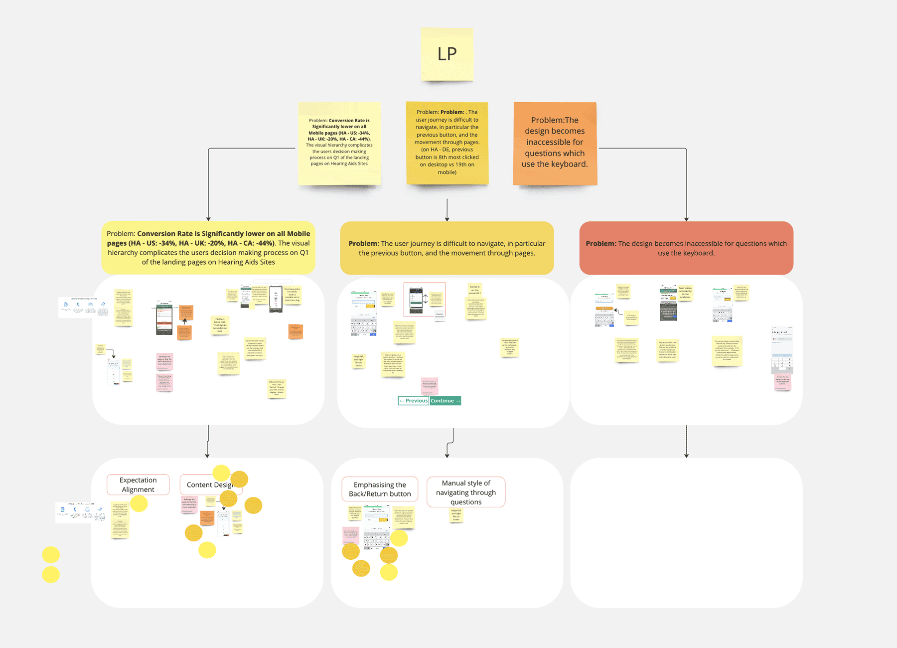
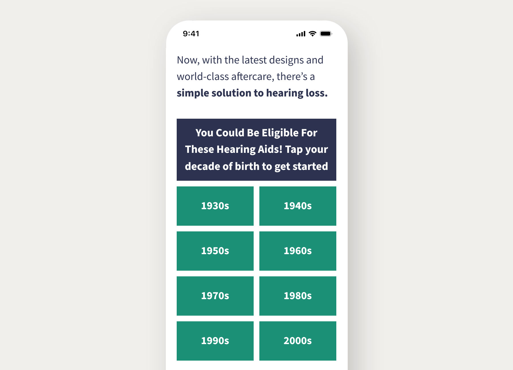
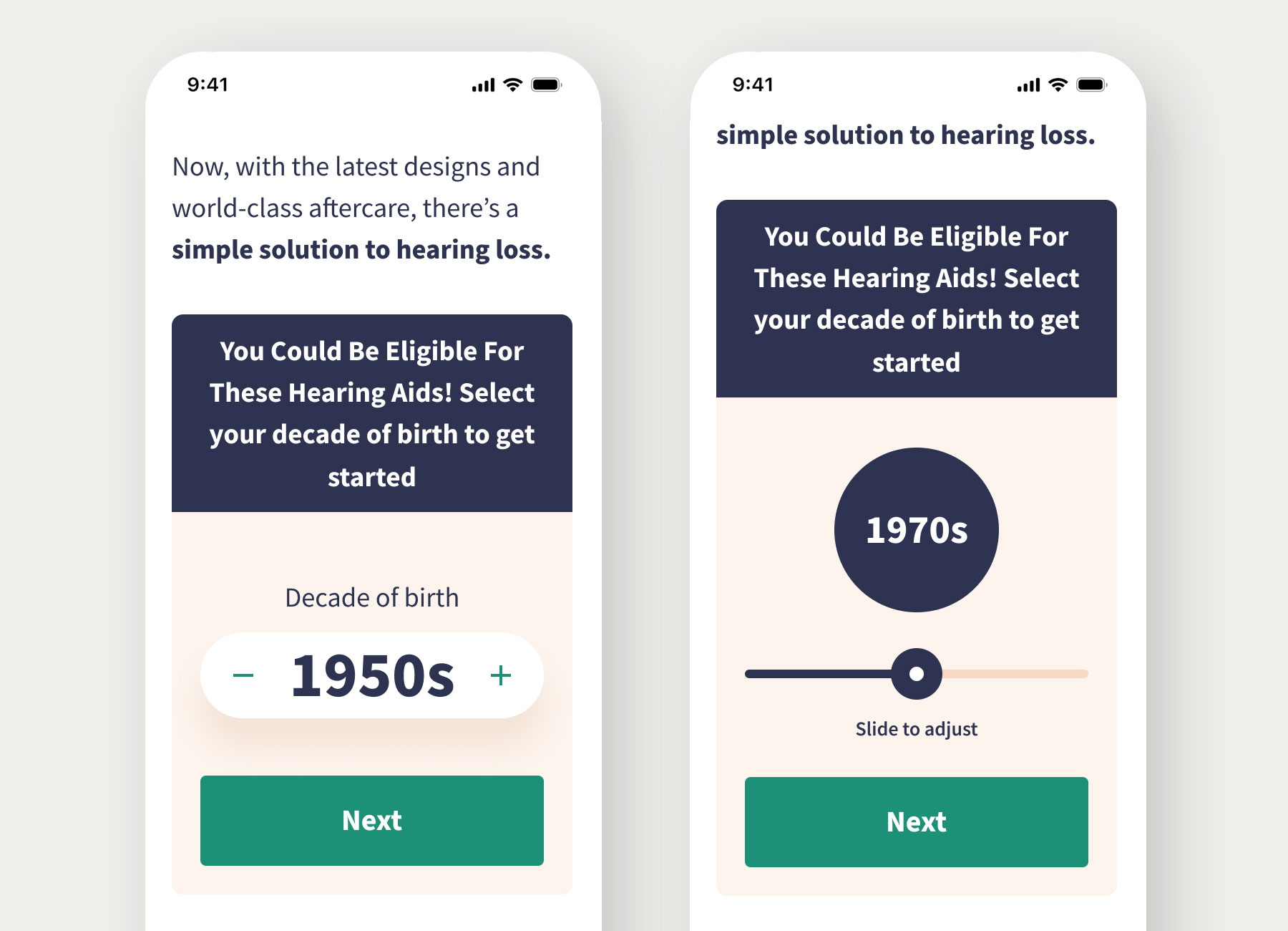
In Figma I worked up a few different options based on the strongest of chosen ideas. The first idea was the leanest, which was to change the buttons from year of birth to decade of birth – reducing the list from 72 buttons to 8.
The next two ideas were much more complex – one was a slider, inviting the user to slide left and right to choose between 8 decades of birth before tapping ‘next’ to continue. The other idea was a counter, inviting users to tap plus or minus to select their decade of birth before tapping ‘next’ to continue. Both of these slightly more complex ideas were visually more fun and interactive, but did require more user interaction than a single button. The slider also presents an issue around dexterity in users interacting with a small device. I presented these three ideas to the team and highlighted the risks of extra user interaction and dexterity concerns. The team were delighted with the designs and decided to test them all.
The plus/minus counter design shows initial signs of being preferred by users, with a conversion rate increase of 9.5%, while the slider is down by 25%. The slider results may point to the issue of dexterity required to interact with, since the majority of our users are older people using mobile devices, but further investigation and testing is required.