One rainy Sunday, my Creative Tech colleague was tinkering with ChatGPT and pondering its use for the Athena Experimentation Squad. He came up with a brilliant idea to use ChatGPT to create a chatbot that customers could use if they needed more information from the advertorial pages we were experimenting with, and went ahead and built it. He showed it to a few of us the next day and we were blown away. It was rudimentary but it had potential, and he invited me to design the UI for it.

Qualitative data had shown that the Solar Panels advertorial pages fell short when it comes to detailed information for users who are in the final stages of their research and are just about ready to buy. Some want to know about solar batteries, others have questions around specific kilowattage, and all want to know how much solar panels will cost them.
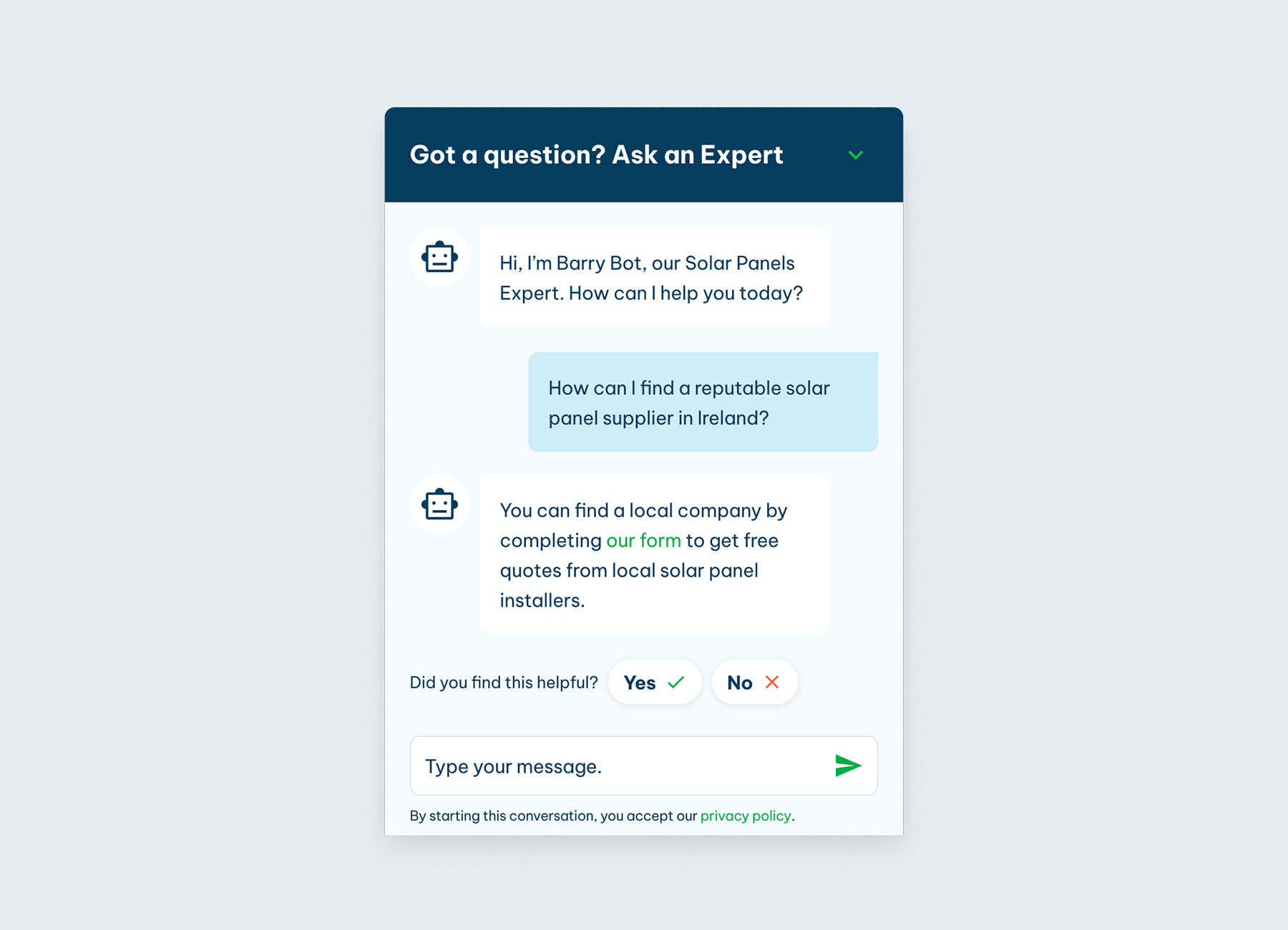
The chatbot was nicknamed Barry, and so I used his name in the opening message to help give a friendly tone to the experience.

I researched chatbots to discover common design patterns and best practices, then created a design for Barry that followed the Eco Experts branding. I mapped out the UI for the different states of the chat window and interactions, and collaborated with the researchers to refine the UX copy in the opening chat message. I then handed the Figma file to my colleague for build.

The chatbot was launched on the Solar Panels UK advertorial and saw almost no engagement, so it had zero impact on our primary metric, conversion rate. We needed more information to understand why, so I worked with my UX Research colleagues to set up moderated user interviews with a look-alike audience, and commenced usability testing. My research uncovered a massive distrust in chatbots – people have had too many bad experiences with unhelpful and irritating chatbots to engage with ours. Users also had mixed feelings toward the name, Barry. For some it reminded them of a fond relative or friend, for others it evoked a grumpy old man.
I modified the copy within the chatbot, to better leverage the AI capabilities of ChatGPT, and removed any bot references by changing the bot icon to a siri-like orb. We also changed the chat assistant’s name to Sol – something generic, and with a reference to the sun and solar panels.
After another round of user interviews and another A/B test, both quant and qual data revealed no change in engagement or attitude toward the chat assistant. The qual data revealed that even without references to bots, the chat window UI is so very associated with regular chat bots that it can’t be separated from user's experiences, so their perception remained negative and they continued to ignore the tool entirely.


With AI assistants like Alexa, Siri and Spotify’s new DJ feature, there’s lots of great AI out there helping people, but how could we use this great function our colleague created and present it in a way that users will engage with? I held an ideation session and the winning idea was to embed the function within an existing component – the FAQs.
I designed a new interface which combined the FAQs with a question field, and created a new section for this content called “Your questions answered”. Users are familiar with and find FAQs helpful so I placed the question field above the FAQs so that users could ask their questions first and browse the FAQs after.
I interviewed another 6 participants and found that the FAQs assistant had far more engagement compared to the chatbot versions. I noted that users scroll behaviour aided the process of driving traffic to the assistant and that users often scrolled to the FAQs in the hope to search for the information they were tasked to find. Strategically placing the AI text input field just above the FAQs served its purpose well. Now that users were engaging with it, we could learn if the assistant was useful, and discovered the answers it gave demonstrated its value and increased confidence among users when engaged with. Users were delighted with the assistant’s versatility and clever responses that gave them direct, bite-sized and practical information.


At the time of departing MVF, the component was in an A/B test. Depending on the results of that test, my alternate design was up for testing, too. This design takes the FAQs idea further by replacing the FAQs with a component that focuses solely on the question field, and turns the old FAQs into question prompts, thus creating a more intelligent style of question and answer component.