Trafila is a new fresh pasta brand based in London. The company needed a logo, a website and a social media presence to start putting their products on the market.
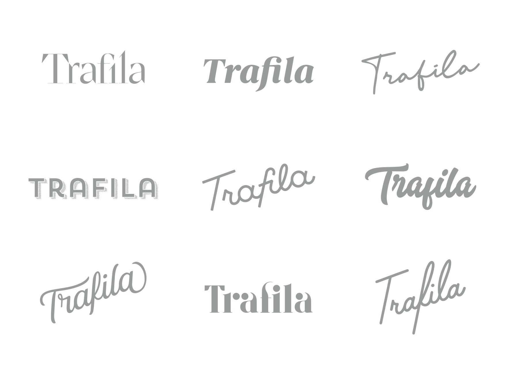

Trafila is the Italian word for the bronze dyes used to create pasta shapes. The client wanted a simple wordmark to be easily recognisable on packaging, in a modern cursive style, and then to explore trafila shapes for the identity. The new identity was to be rolled out in packaging, the website and on social media. The design team explored several typographic directions – including the client's requested cursive style. I started by looking at fonts online, tracing screenshots of my chosen variations and tweaking them to get the balance right. We submitted several options and the final logo was chosen. Next, I chose a colour palette of charcoal, wheat and white for a combination that was both modern yet earthy – drawing on the ingredients that go into making the product.
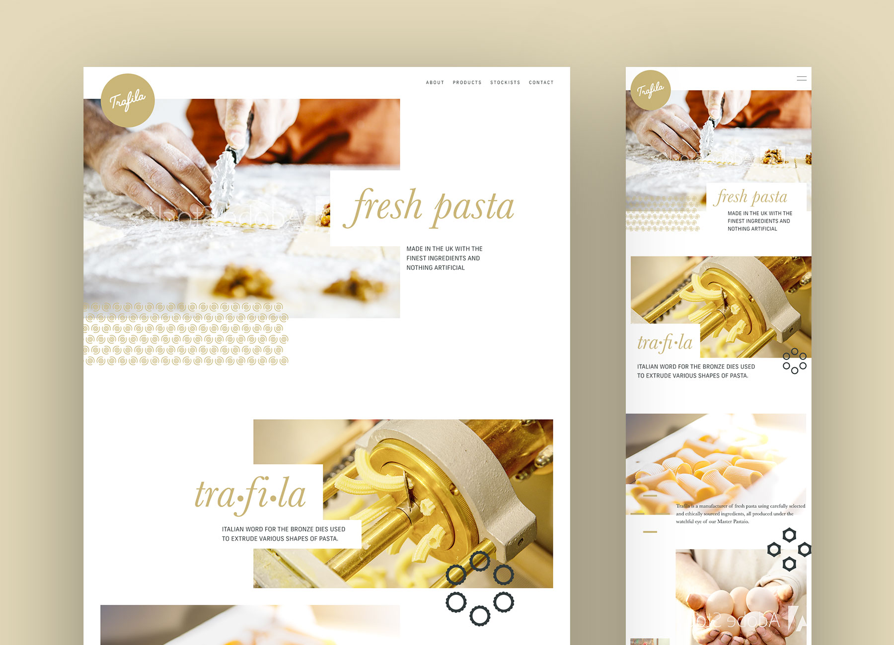
Trafila is a new company and so for now, just needs a sinlge page website to give an overview of the company, the products and the quality. Imagery was key – we chose a light and airy photography style with a focus on making the pasta mouthwatering. Given the lack of substantial content, I designed the website to be image-lead with a playful use of balance and alignment, and a stylish use of animation. At the time of writing the website is not yet live – once the packaging is rolled out, we can shoot and add the products to the website.
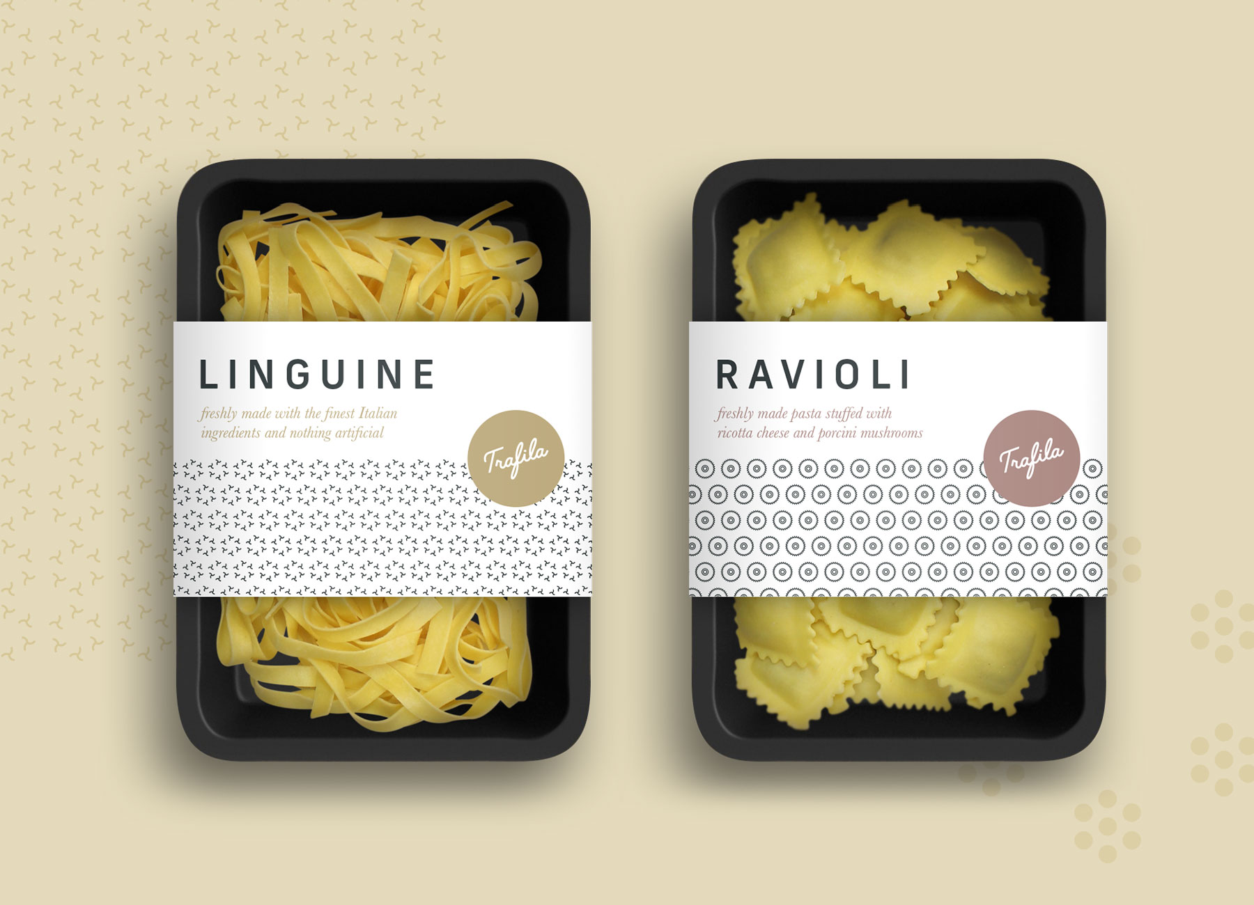
The packaging brief was to design labels for the front and back of the fresh pasta packs. I designed several routes – looking at ways to use the trafila shapes and colour to differentiate between each pasta type and flavour (for filled pasta). A design was chosen, and I created a colour palette for the different flavours and drew trafila shapes for each type of pasta. The challenge was to create shapes for pasta which aren't cut with trafilas, like ravioli. For these, I researched how they are made and simplified the shapes of the devices that cut them.
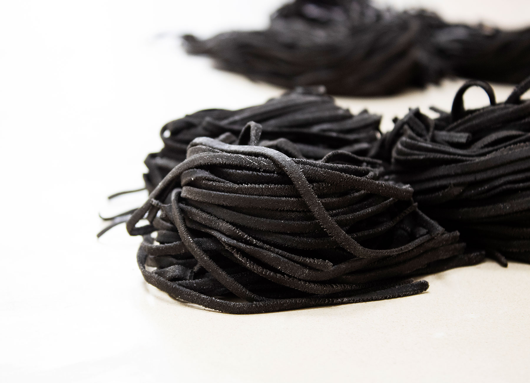
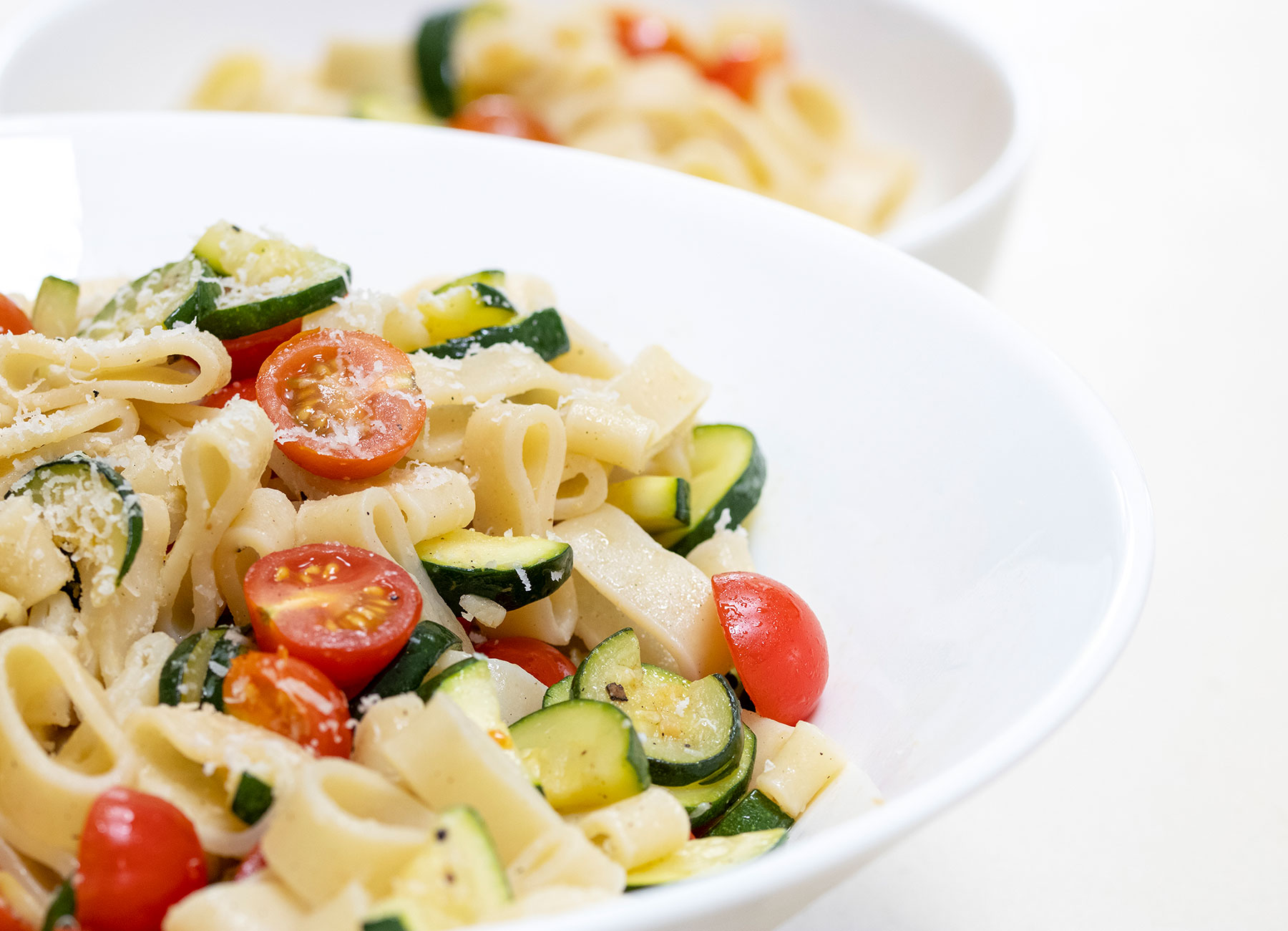
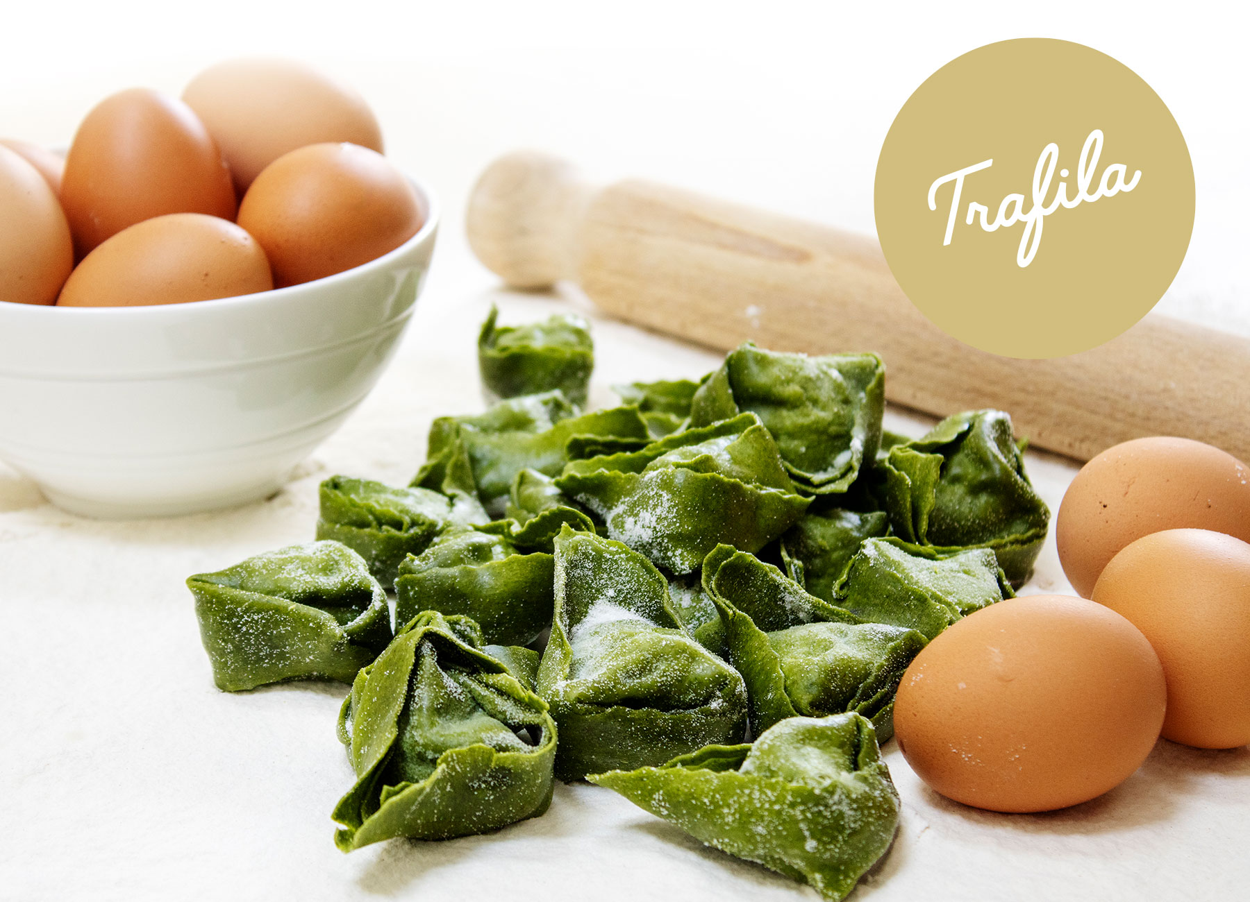
Using stock imagery on the website seemed like a missed opportunity considering our proximity to the factory and my photographic experience. And so I visited the Trafila premises and shot some of the machines and staff at work. We even took some pasta with us so I could shoot it in a home kitchen for ambient shots, both cooked and uncooked (I also did the cooking!). The challenge was keeping the pasta looking fresh off the machines and not dry from being out too long. I'm swapping out the stock imagery on the website for what I've shot, as I go.
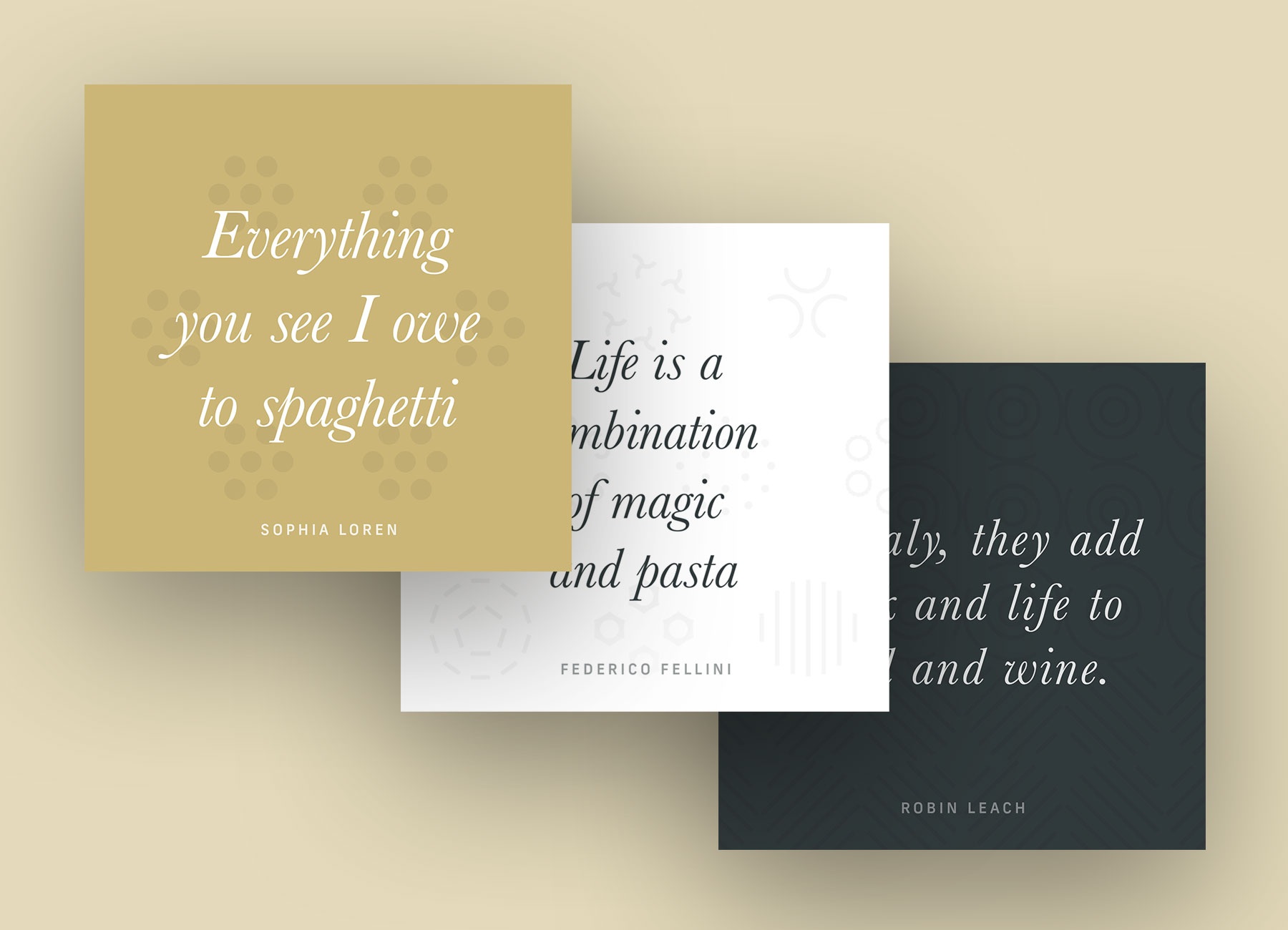
I created a social media plan for posting predominantly on Instagram, outlining posts for introducing the new brand, highlighting its ingredients, how it's made, and showing how the products can be used. The challenge was in creating content – no content exists for the brand outside of what I have already created and there's so much left to shoot and create. While we're still creating content, I've been creative and found ways to use what we have and more, such as famous quotes about pasta. You can check out the Instagram feed for more.