The Online Acquisition team advertise across several verticals and direct users to landing pages containing monetised calls-to-action. Revenue was dipping so an agile, cross-functional team was formed to work on the business goal of increasing the visitor to sign-up rate by 30%.

The Online Acquisition funnel consists of B2B verticals such as Project Management Software but traffic is low which means low volume for conducting A/B tests and a long time to get enough quant data to reach statistical significance. Additionally, since A/B experiments require Creative Techs to use Optimizely which injects javascript into the pages to serve up changes to half the audience, this can impact page performance and these pages already suffer from code bloat the WordPress plugin, Elementor. We also had very little data on our customers and had to start user research from scratch.
We started by running tests from the backlog to get things moving while we learned about our parameters and how to work within them. A solid strategy soon emerged – we would work in two week sprints, and conduct one big experiment per sprint that covered multiple user opportunities. This would give us the time and scope for A/B testing to reach statistical significance and allow time to conduct user interviews in tandem. More importantly, it would allow us to review quantitative and qualitative data together.
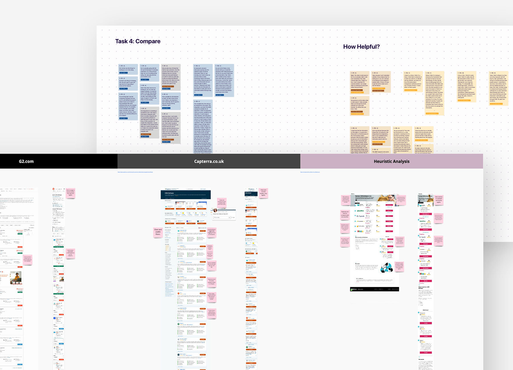
I worked with UXR on the research strategy and conducted an heuristic analysis on our live pages as well as a competitor analysis. These analyses helped the team understand where our service falls short and how we compare to our competitors. I then conducted moderated user interviews to uncover user needs and pain points, and compiled insights which I shared with the team. I included clips from the interviews in my download session to drive empathy for our customers in the team.
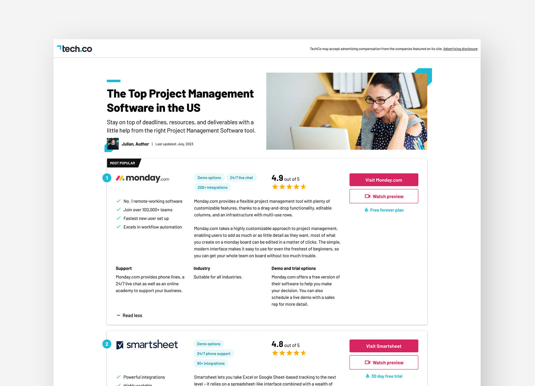
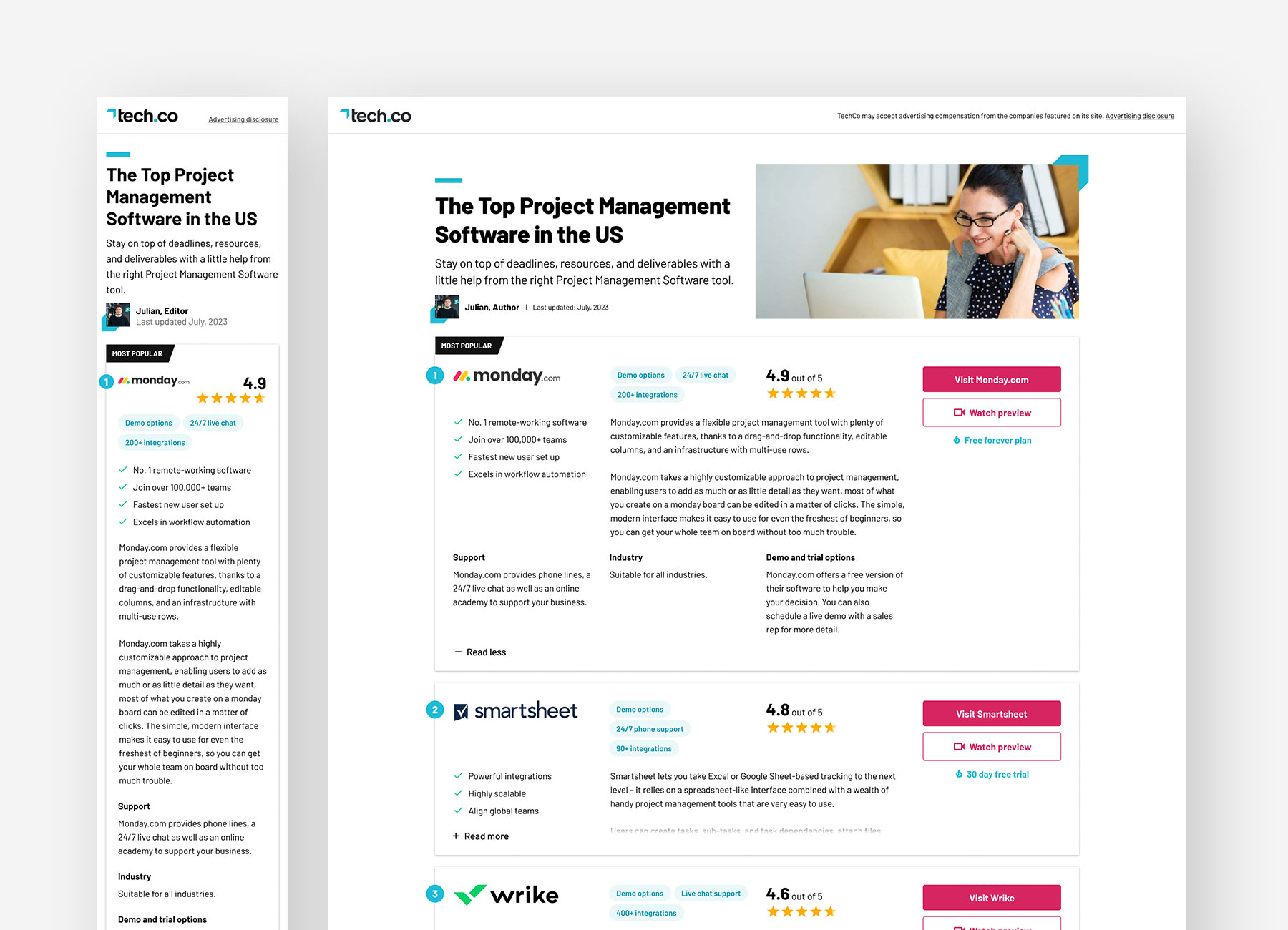
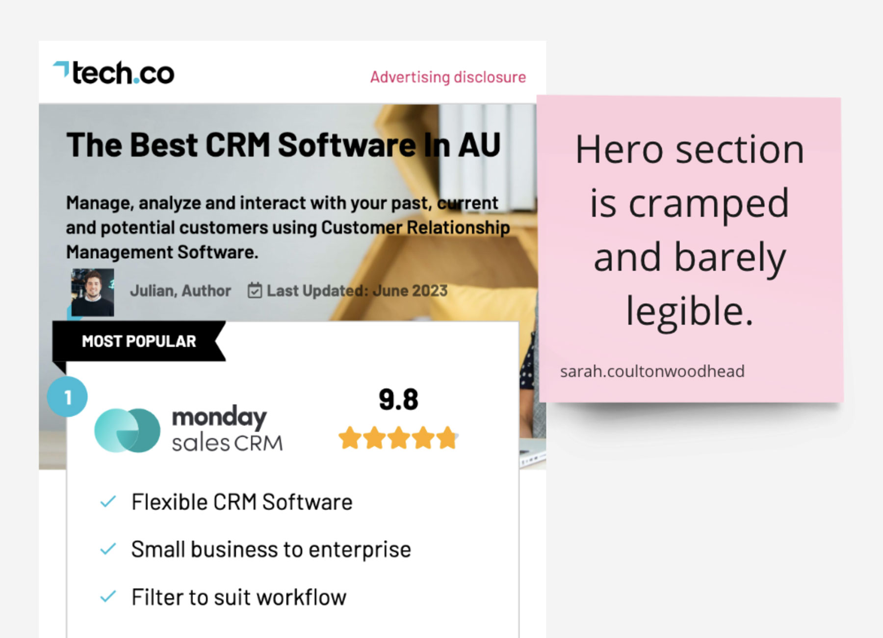
Research revealed that our users are generally the decision makers when it comes to purchasing software, and that there are certain factors they take into account when deciding which software to go with. These include themes of support, ease of use and a desire to see the software in action before adding a provider to their shortlist or proceeding to purchase. An opportunity that surfaced from my heuristic analysis and the user interviews was a lack of confidence that users are in the right place due to a cramped, messy and unreadable hero section on our live template. These two opportunities formed our first experiment.
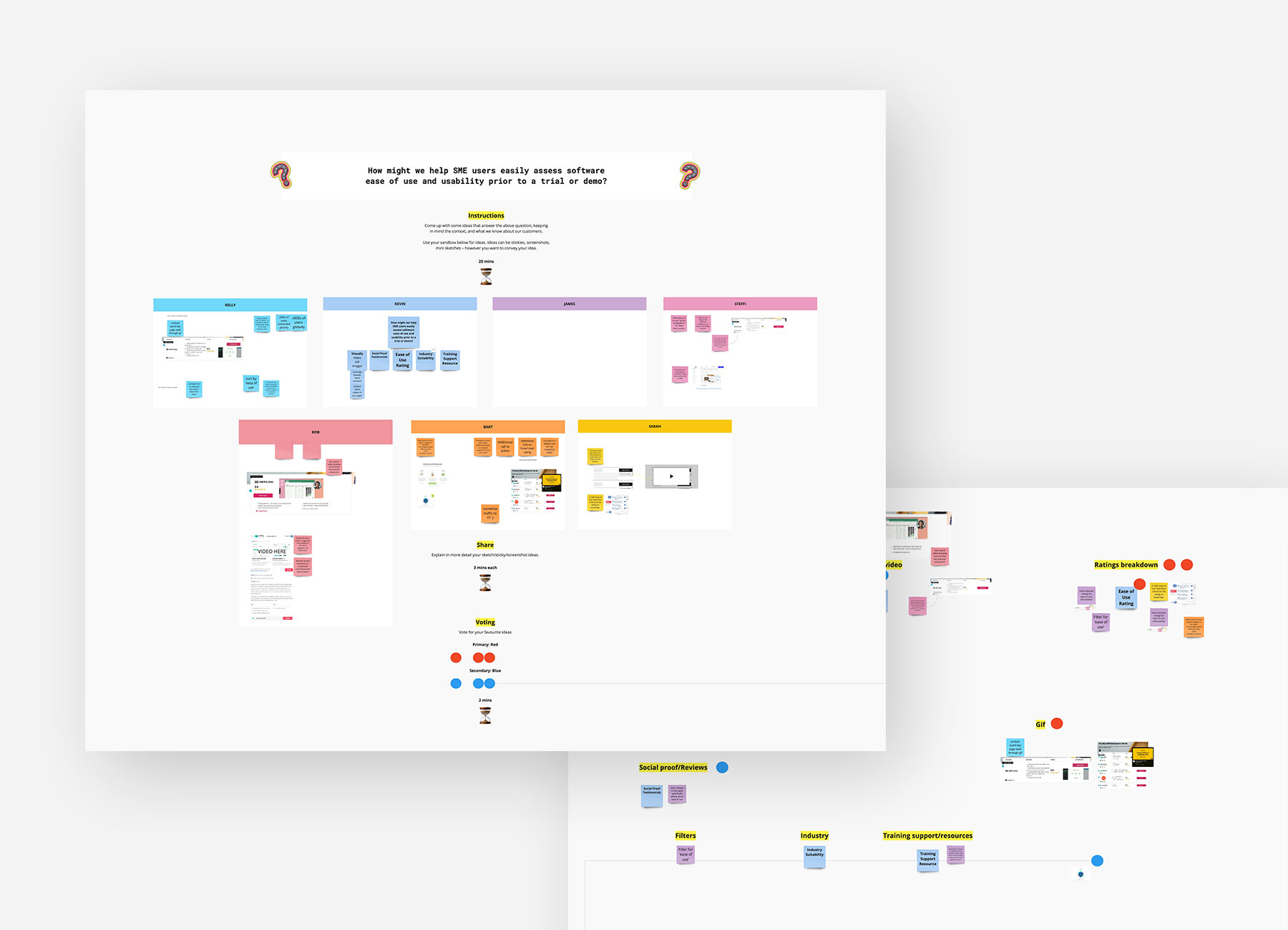
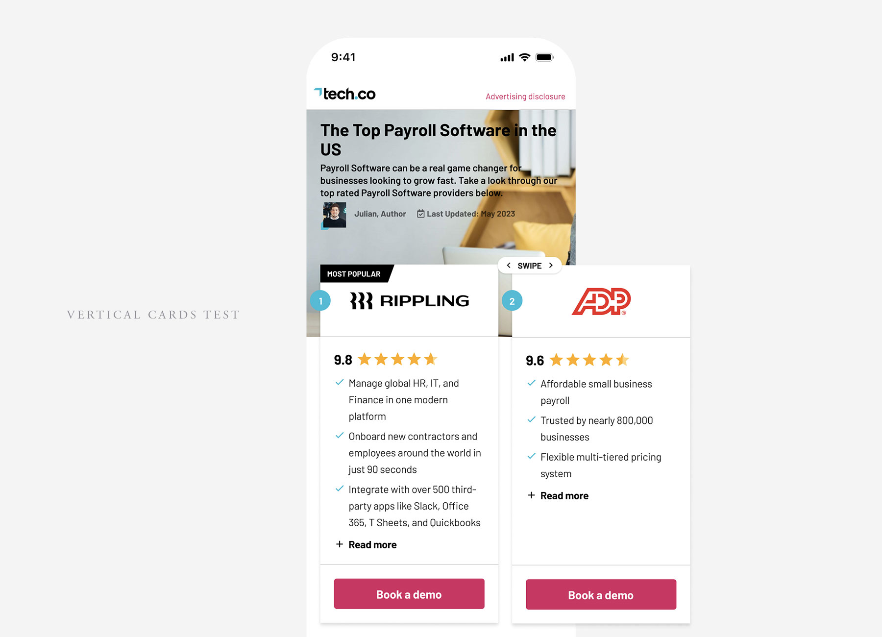
I held an ideation session to generate ideas that answered our two opportunities and then voted on those we thought would have the most success and learnings. The ideas we took forward were to tidy up the hero section and make it clearer, highlight the key business decision factors within the provider cards, and to include software provider videos from YouTube on our page.
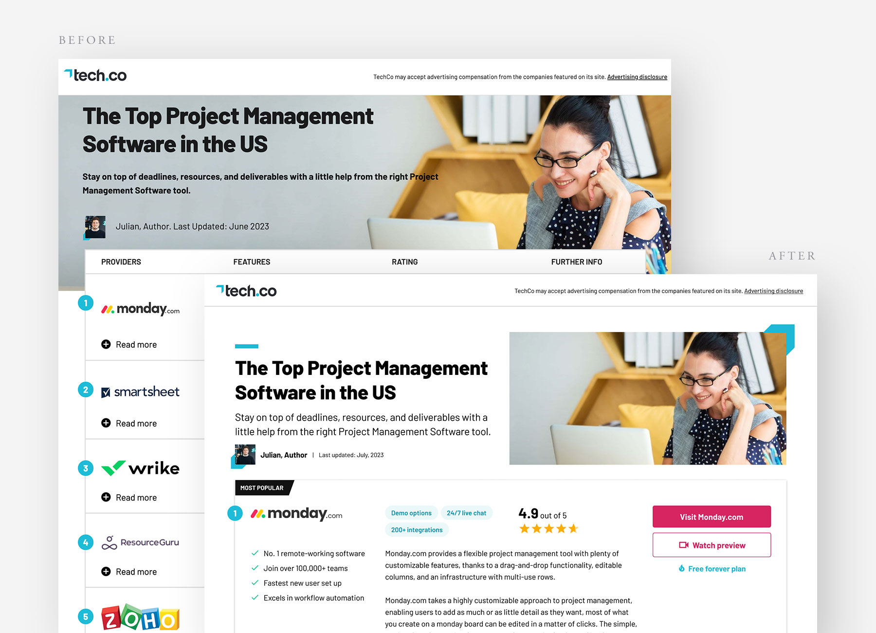
In Figma I started with the hero section and leveraged the Tech.co brand site to redesign the top part of the page so that it was not only tidy and easy to read, but also much more on brand.
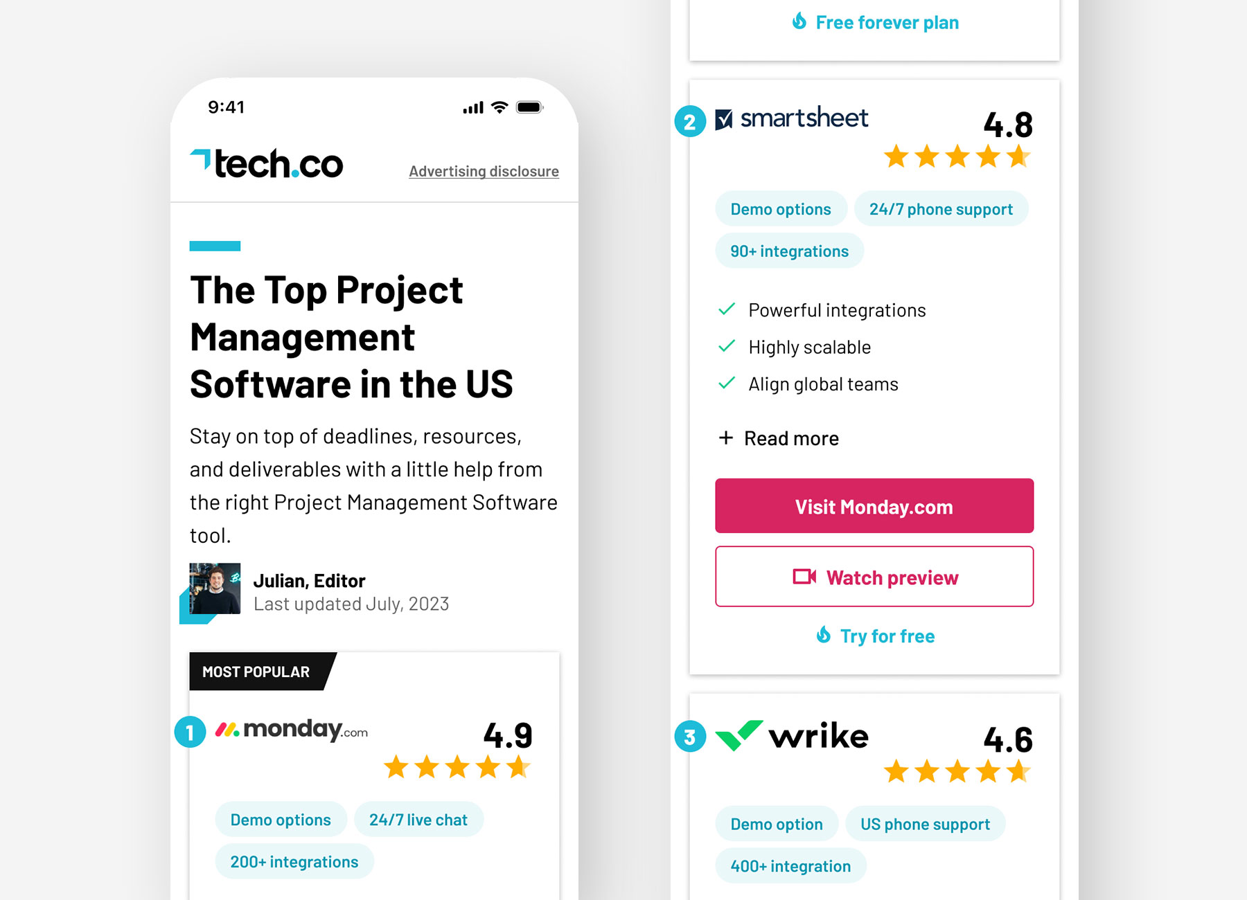
Moving on to the business decision factors, I added info chips to the cards that highlighted specific features such as support, demo options and integrations so that users could understand at a glance if the provider offered the most important factors for their business needs. I added further info on these to the cards, accessible upon expanding the ‘read more’ section. Finally, I included a button on the cards that launched a modal containing the provider’s product tour video.
Time on site, bounce rate and scroll-depth all saw significant improvements with bounce rate decreasing by -5%.
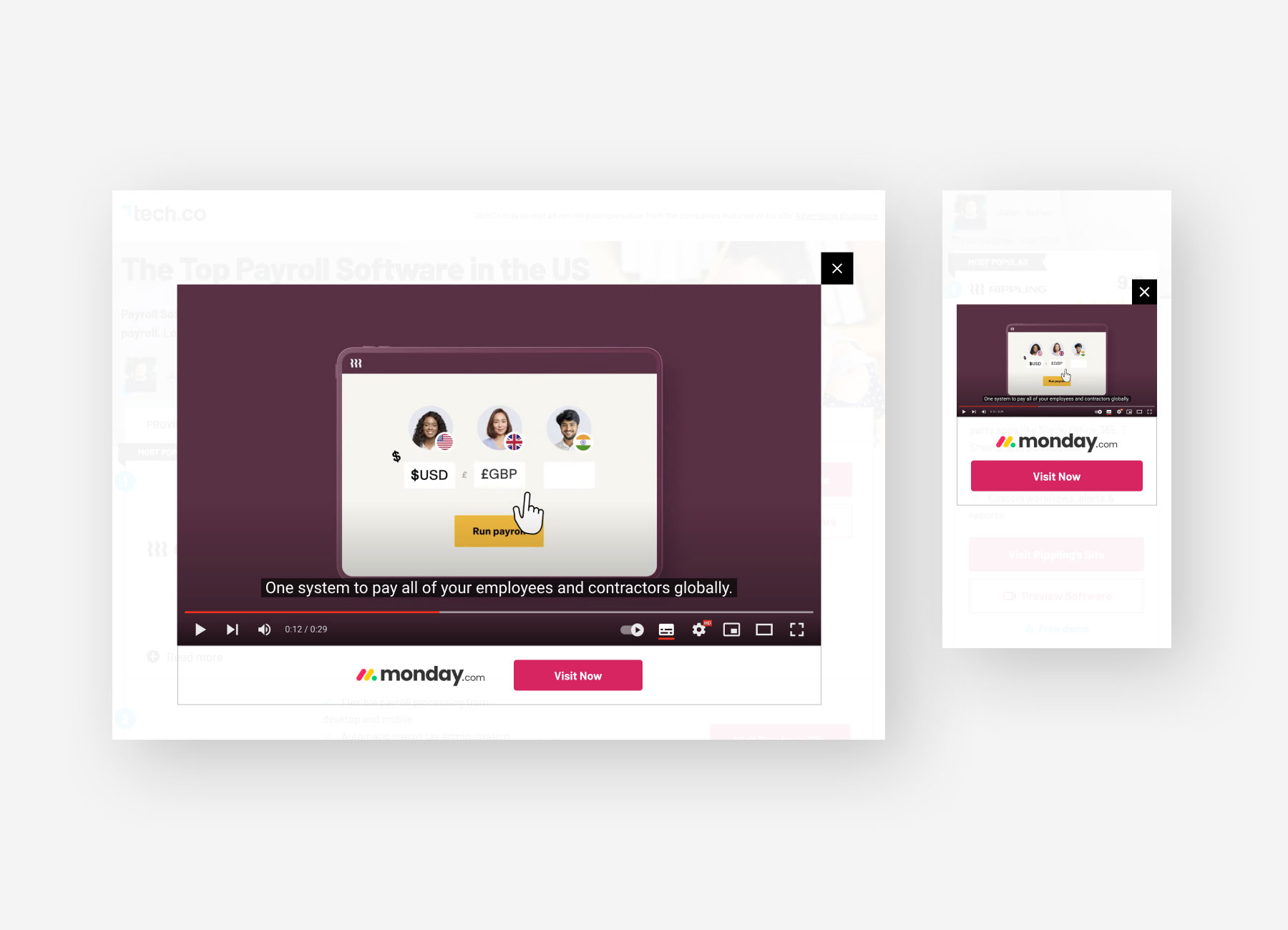
Our primary metrics – sign-up rate and click-out rate were down. Fortunately, I had user research to tell us why. Users found the info chips helpful and many were engaged enough to expand the cards to learn more. The content in the expandable section, however, needed improvement as it was too waffley. The video modal performed well, with 13% of all click-outs coming from the 6% of users who opened the modal. Insights from qual research told us that this was dependent on how useful the video content was – product tours were much more helpful than marketing videos.
We learned a lot from the qual and quant data from our first experiment and had plenty to iterate with. Since the improved hero section resulted in greater scroll-depth and time on site, this is now being rolled out to the template for all verticals. The business decision factors still need work, and will be iterated on after we carry out the next few experiments.