Holiday Cottage Mortgages (HCM) is a mortgage broker specialising in mortgages for holiday lets. A desire to help make the process move more smoothly for customers fuelled the company to create a platform to minimise paperwork and give people the best chance of success from their application. HCM engaged two developers to build the platform and I was brought on to design the UI for the application platform (the consumer-facing website was designed by someone else.)
We began by discussing the functionality and the client's desire to make the experience as smooth as possible. To cut down costs, the client provided their own user journey map and identified the different types of mortgage questions that would be avialable in the application process. The budget was extremely tight, so my sole task was on creating a UI design that was attractive and easy to use, but for desktop only.
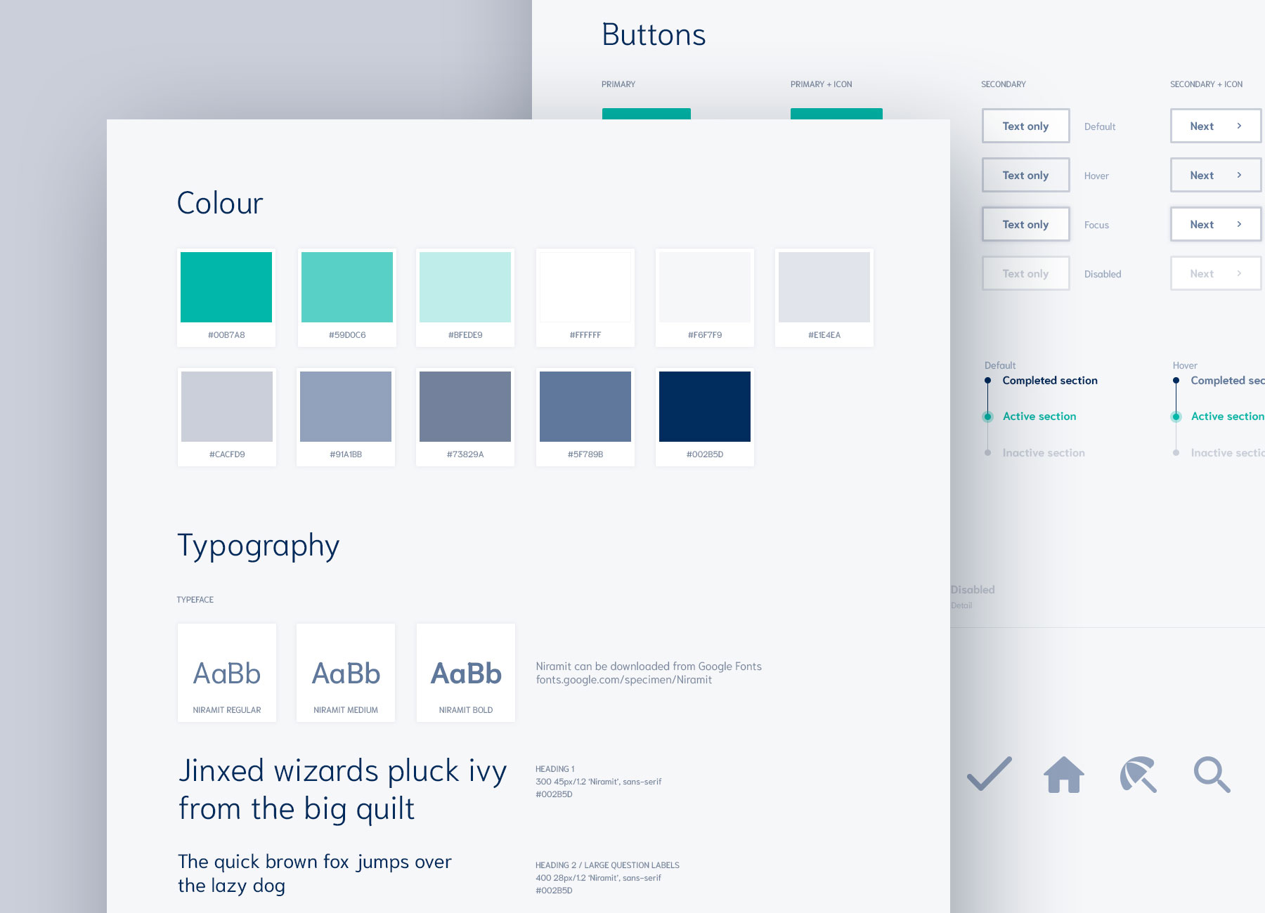
We identified the key pages within the application that needed visualising, and I started with a couple to get client feedback on direction. Once the direction was finalised, I fleshed out the rest of the key pages and question types, and created a style guide for the developers.
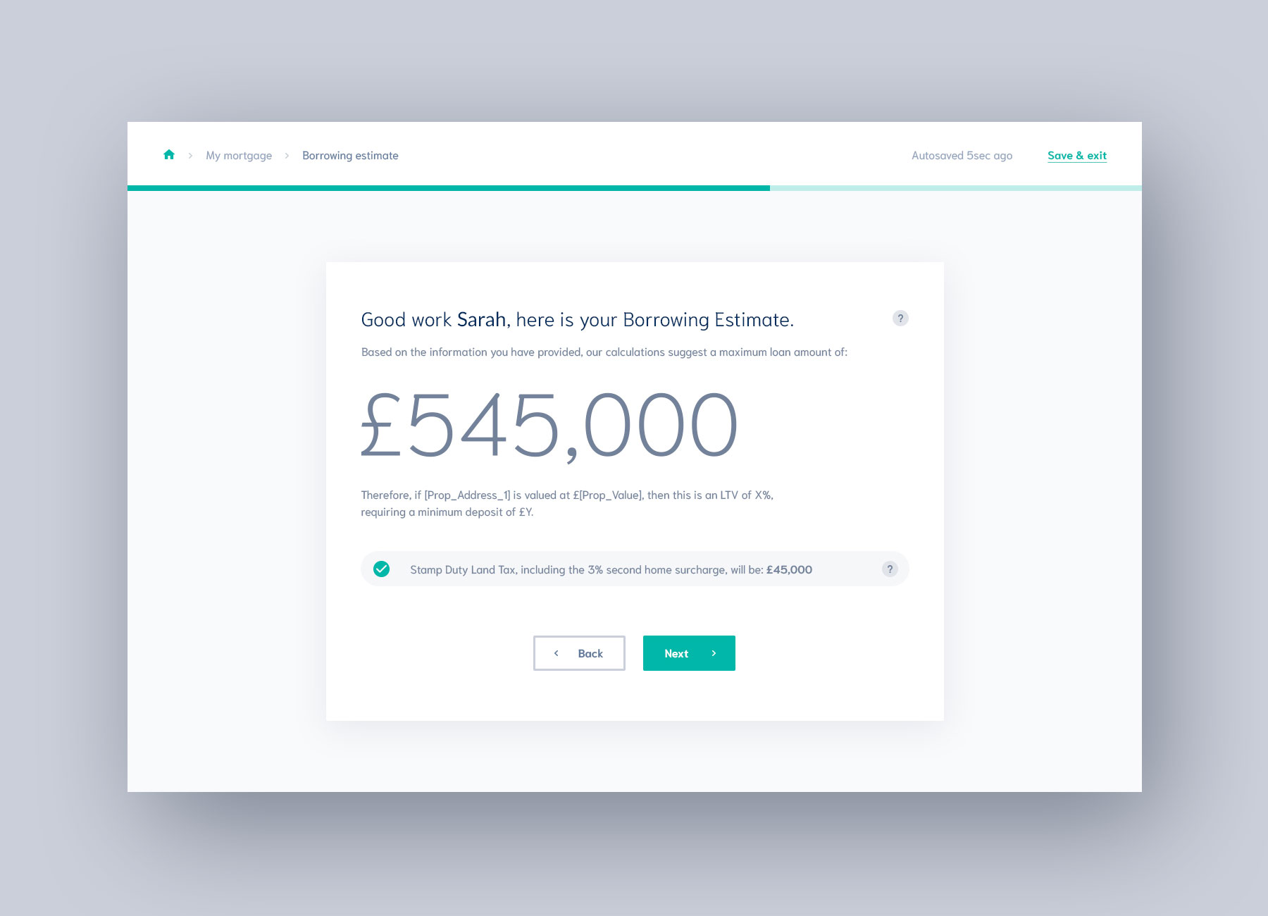
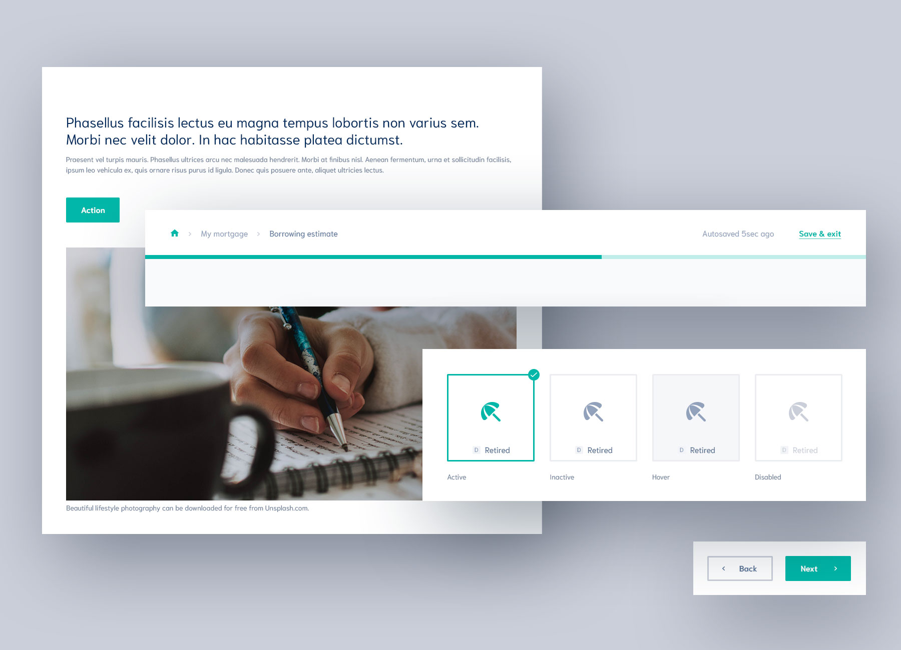
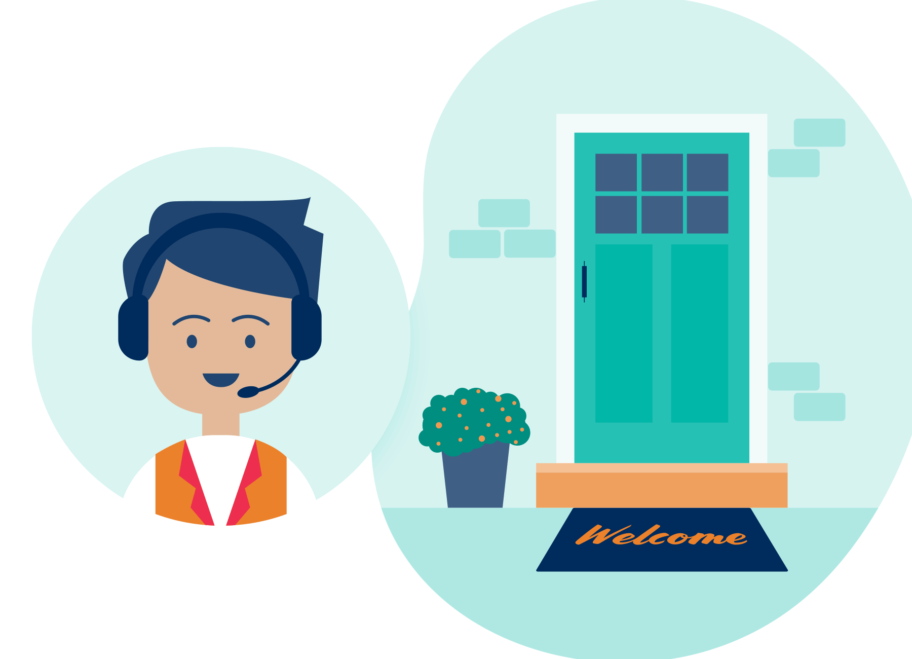
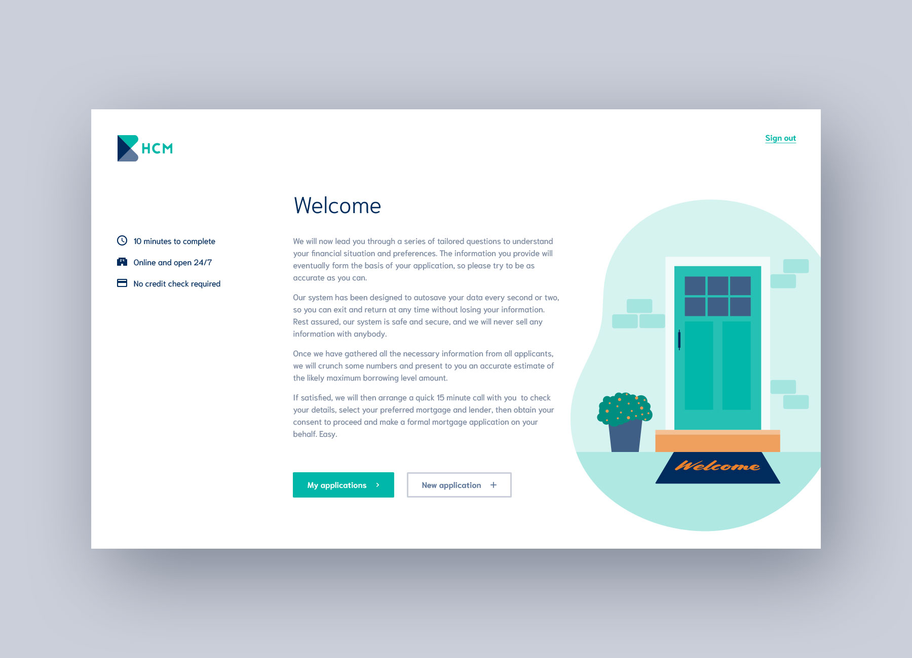
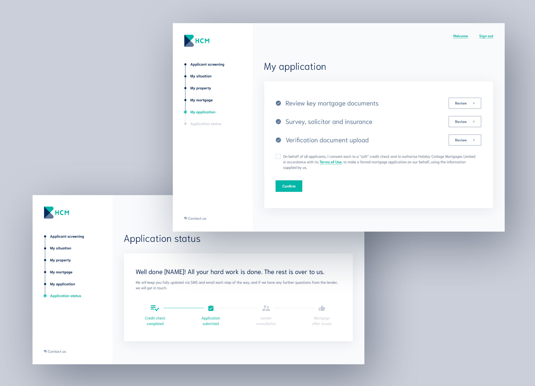
Mortgage applications are tedious so my challenge was to break up the monotony by making the different types of questions engaging, find ways to introduce imagery and also find ways to break up the huge list of questions people need to answer. I decided that we should divide the questions into sections, and use a progress bar to visually indicate progress and spur users on to completing their mammoth task. Next, I added a set of 'back' and 'next' buttons to the bottom of each question section to make it easy for users to move back and forth between completed sections. When it came to designing individual types of questions, some were always going to be simple text input fields, but others, like questions that require the selection from a small list of radio buttons, could be paired with icons to become something much more fun to select – I called them picture questions. I also made a couple of illustrations for the dashboard, to help lift some of the more dense content.
The biggest challenge for this project was my limited involvement and control over the whole design process, due to budget constraints. I wasn't able to work with the client in the beginning to flesh out any user journeys; I was unable to work with the developers on implementing the designs, nor offer feedback or make tweaks to the frontend before launch – my involvement finished once I handed over a folder of PSDs. In my experience, UI designs are implemented better and also designed better if you can collaborate with other stakeholders, especially the dev team. Working in a design silo was out of my control and my key learning from this was since I was unable to convince the client to spend more on having the team work together, I had to let it go and do the best job I could do within the project restrictions. Next time, I think I would make a stronger case for at least working with the developers to ensure that the finished product launches as polished as possible.