MVF's Growth Team work to expand MVF's verticals and subcategories by launching paid campaigns and landing pages to secure customers for our clients. In the absence of any design expertise in the team, I was brought into the fold to improve the design and user experience of the pages and customer journey.
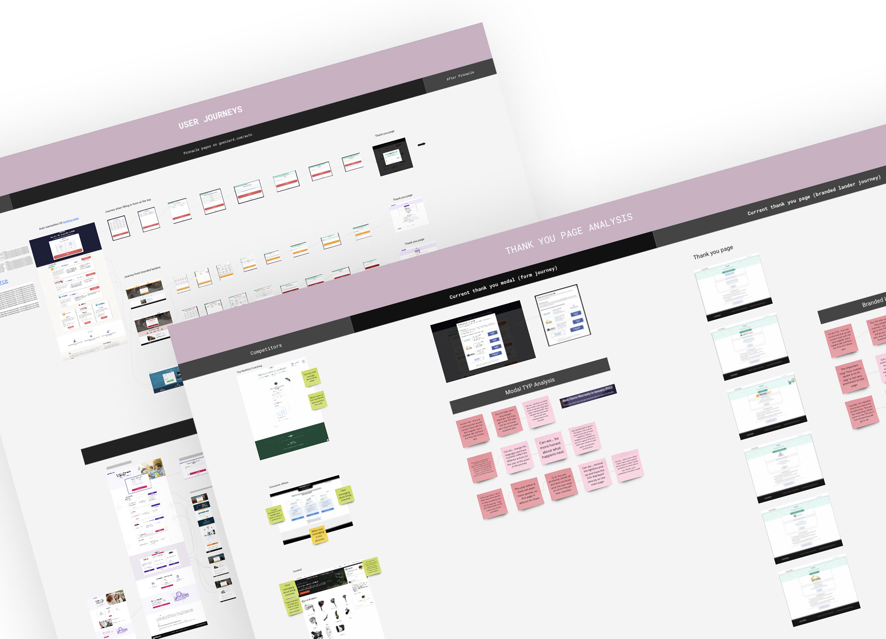
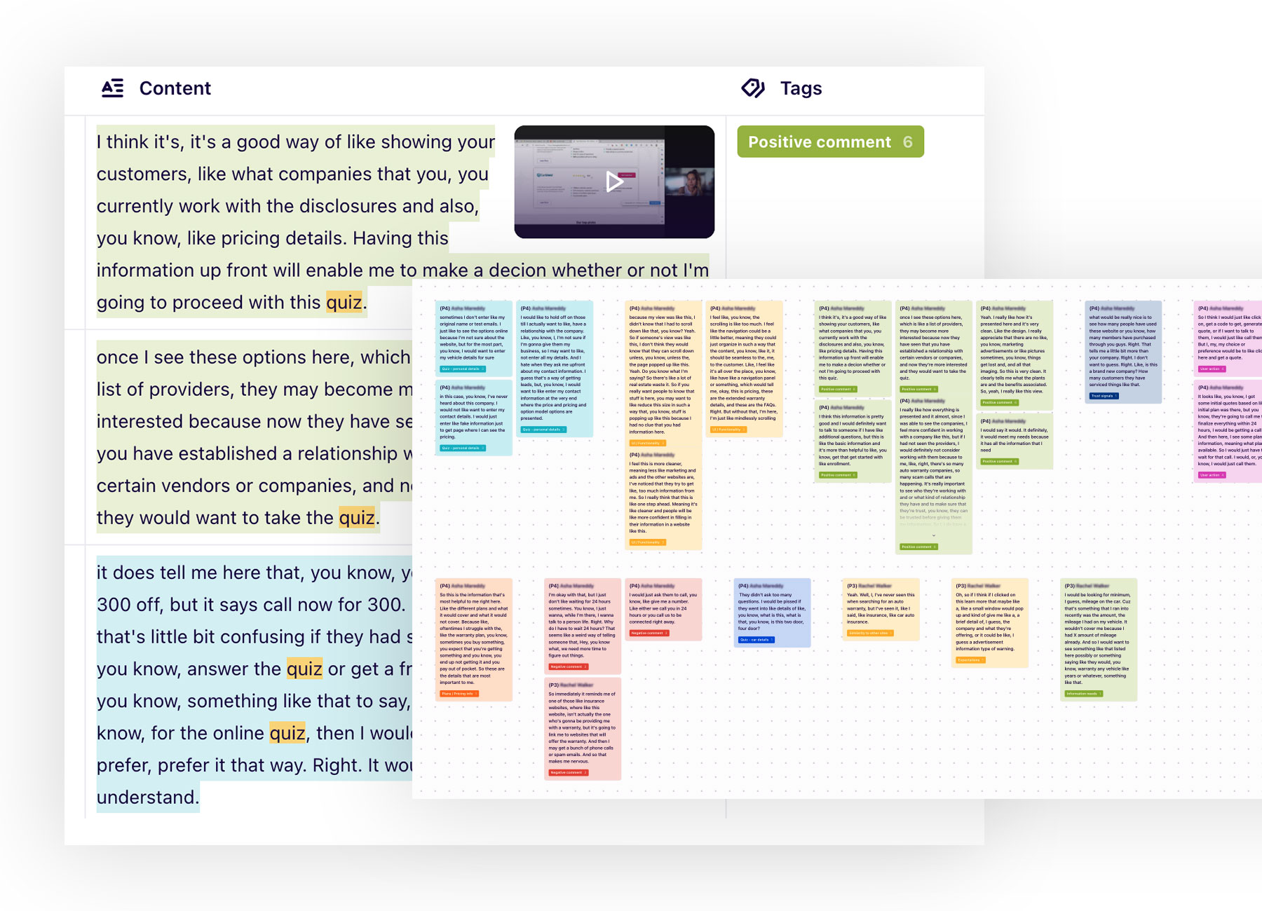
I completed a user journey map and heuristic analysis of the existing thank you page to familairise myself with the parameters of the product and start to see the users point of view. I then put a CSAT survey live on some of the thank you pages, to start gathering data around pain points and user needs. Working with a UX Designer, we held user interviews with a look-alike audience to discover further pain points and insights into our customers. We used Dovetail to manage recordings and tagged anything from the transcripts that was notable or helped answer our research questions.
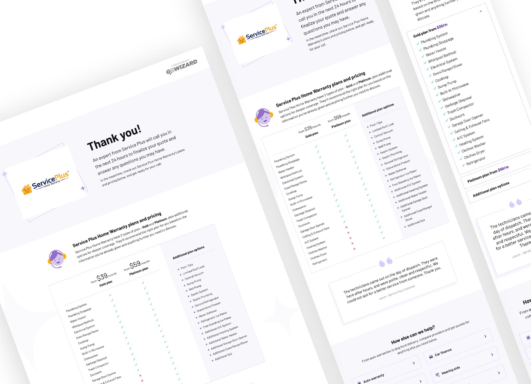
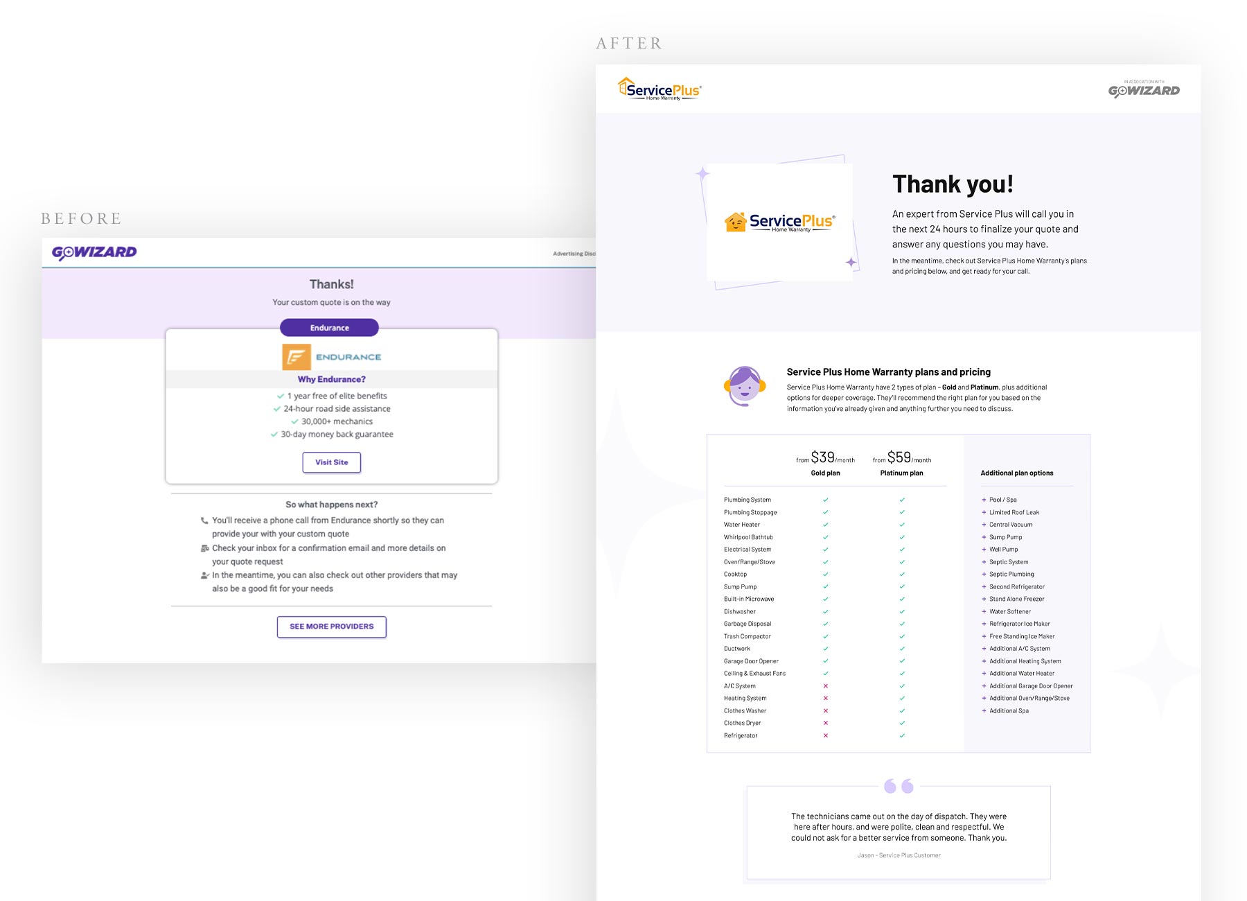
We collated the data from both the interviews and the CSAT into distinct insights from which my UX colleague pulled into an opportunity solution tree. We had a workshop to identify the biggest opportunites in terms of user needs, commercial goals and effort required, and discovered the biggest opportunity was in the thank you page part of the user journey. The existing thank you page was vague and did little to communicate next steps or prepare customers for their impending sales call.
The thank you page was light on info, and this frustrated every participant we spoke to.
Participants wanted to see at least some info on what their matched supplier offers, if not a full or ballpark quote. For commercial reasons, we couldn't reveal their quote, but we could give users a lot more than what they were getting.
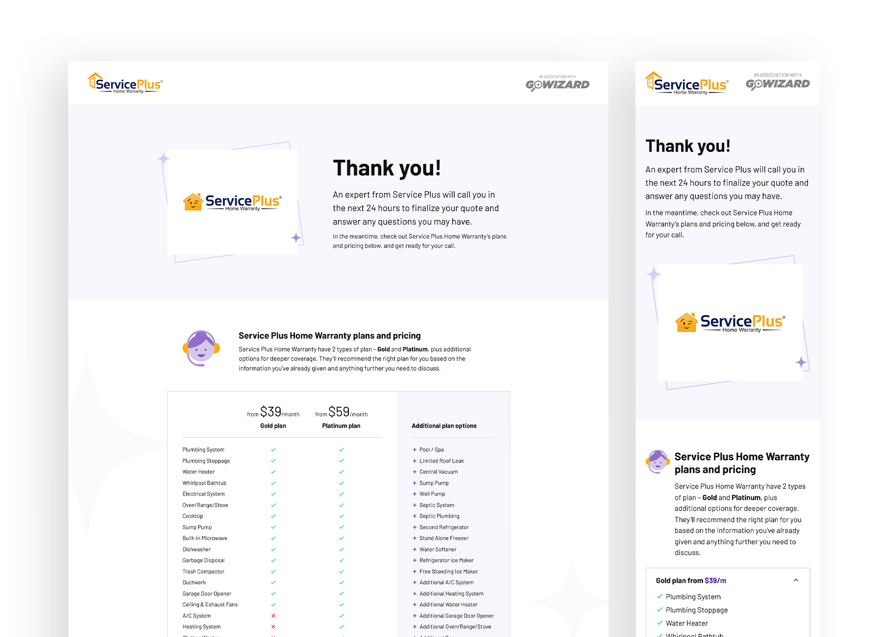
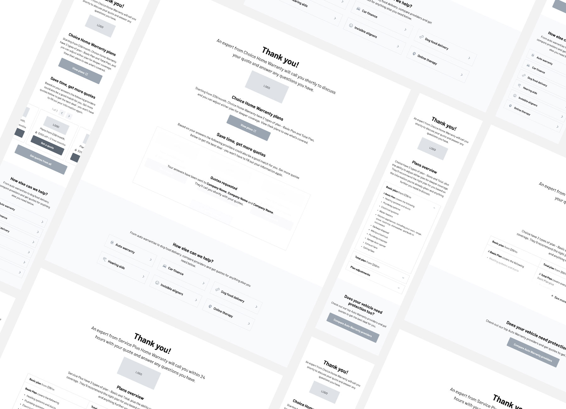
With the user insights and opporunities in mind, I created wireframes for a new thank you page that made it clear what the next steps were, gave users more useful information about who was going to call them, and in lieu of a quote, gave users indicative costs for the product they were seeking to purchase.
After a couple rounds of stakeholder feedback, I was ready to move into visual design. I used the GoWizard branding to give the design personality, visual hierarchy and a clear distinction between content sections.
I used the colour palette and iconography to lift the text-heavy page, negative space to make content easily digestible, and introduced an accordion for mobile users, to keep the length of the page on smaller screens less daunting.
The stakeholders within the Growth Team were delighted with the finished designs and couldn't wait to get them into build. I attended a refinement session with the Product Manager and Engineer to discuss the designs and handoff the Figma file and assets.
Then, the project was shelved. It's never been built or tested, but there are plans to revisit it in the future. But, the user insights and UI Designs remain valueable assets that I have referred back to on several occasions for other projects, so my efforts were worthwhile.