The Appwiki Back Office is an advertising platform for internal staff, clients and publishing partners. I joined MVF to work on the UI for new product features, and continued to work on the product when required for the duration of my time at MVF.


Appwiki was a fairly new business acquisition, and no other MVF designer had worked on it yet. This meant completely starting from scratch on software that was loosely based on the MVF Corporate brand, and as it was acquired from a company in the Netherlands, mostly in Dutch still. I was also new to the business, and new to this kind of customer acquisition world.
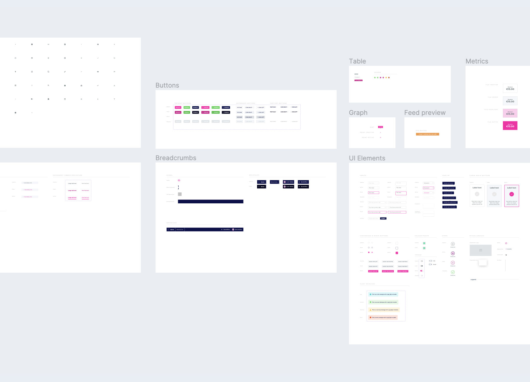
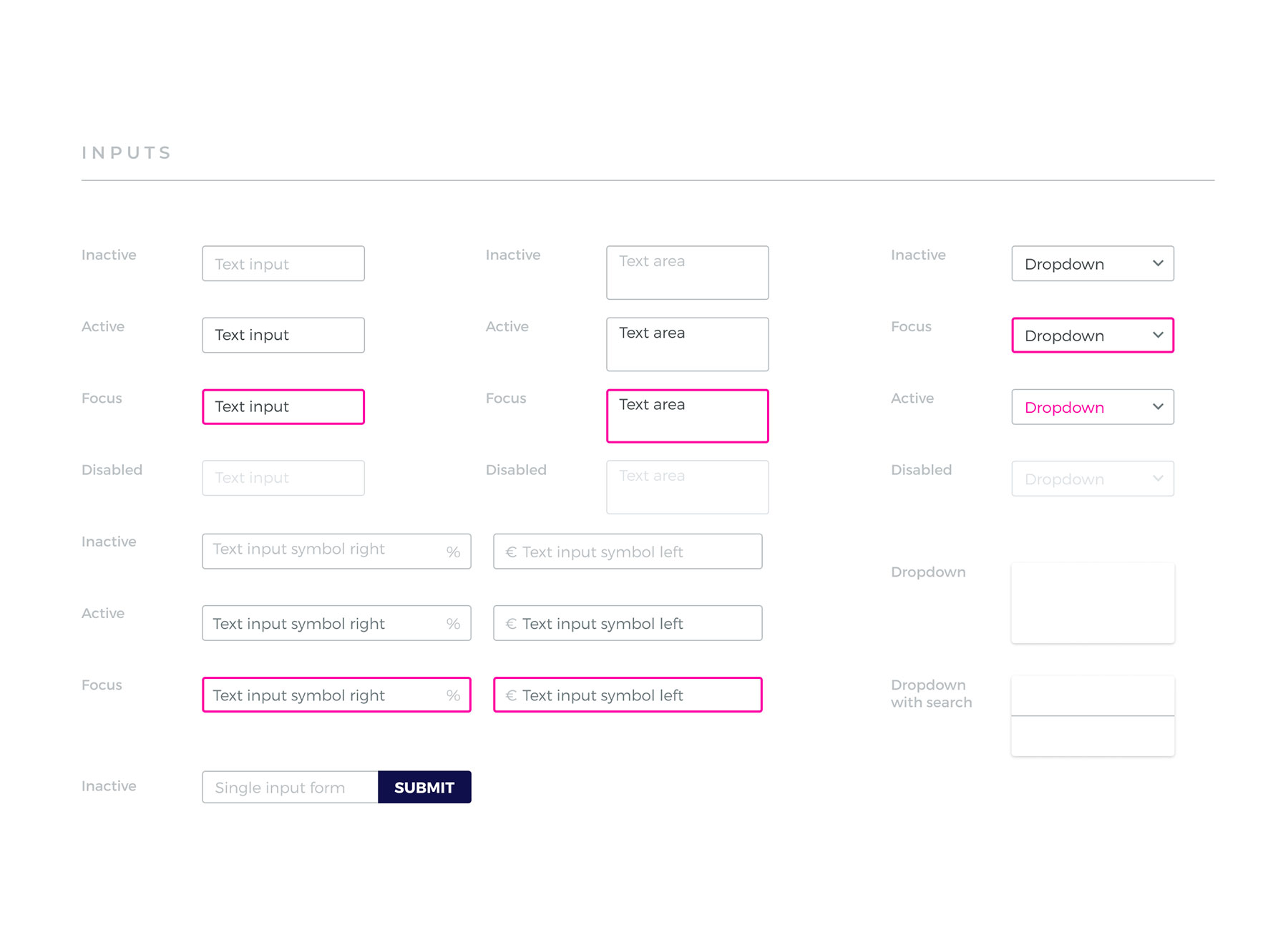
My first few design tasks were small and allowed me time to build up assets. Working in Sketch at first, then migrating to Figma, I started to create and assemble a library of assets and styles. I noted all of the colour and type styles used throughout the product, then recreated the navigation, form and tabular elements into atomic components that enabled me to rapidly recreate dashboard screens for any task.
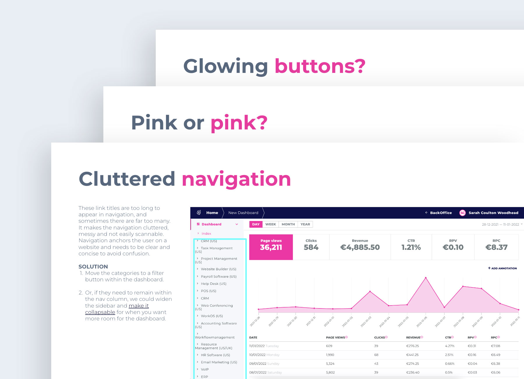
As I became more familiar with the product I noticed a few inconsistencies and decided to complete an heuristic evaluation of the product UI and suggest tweaks to improve the UX. I presented a deck to a group of stakeholders that highlighted the issues and offered reccommendations – largely small tweaks that could be done in and amongst other big work.
Stakeholders were delighted by the suggestions and prioritised easy wins such as colour inconsistencies, and button drop shadows. Suggestions like changing the table typeface from the wide-set Montseraat to a slimmer Roboto, were parked due to scope. But ultimately, the team executed a number of my suggestions and the interface began to improve.
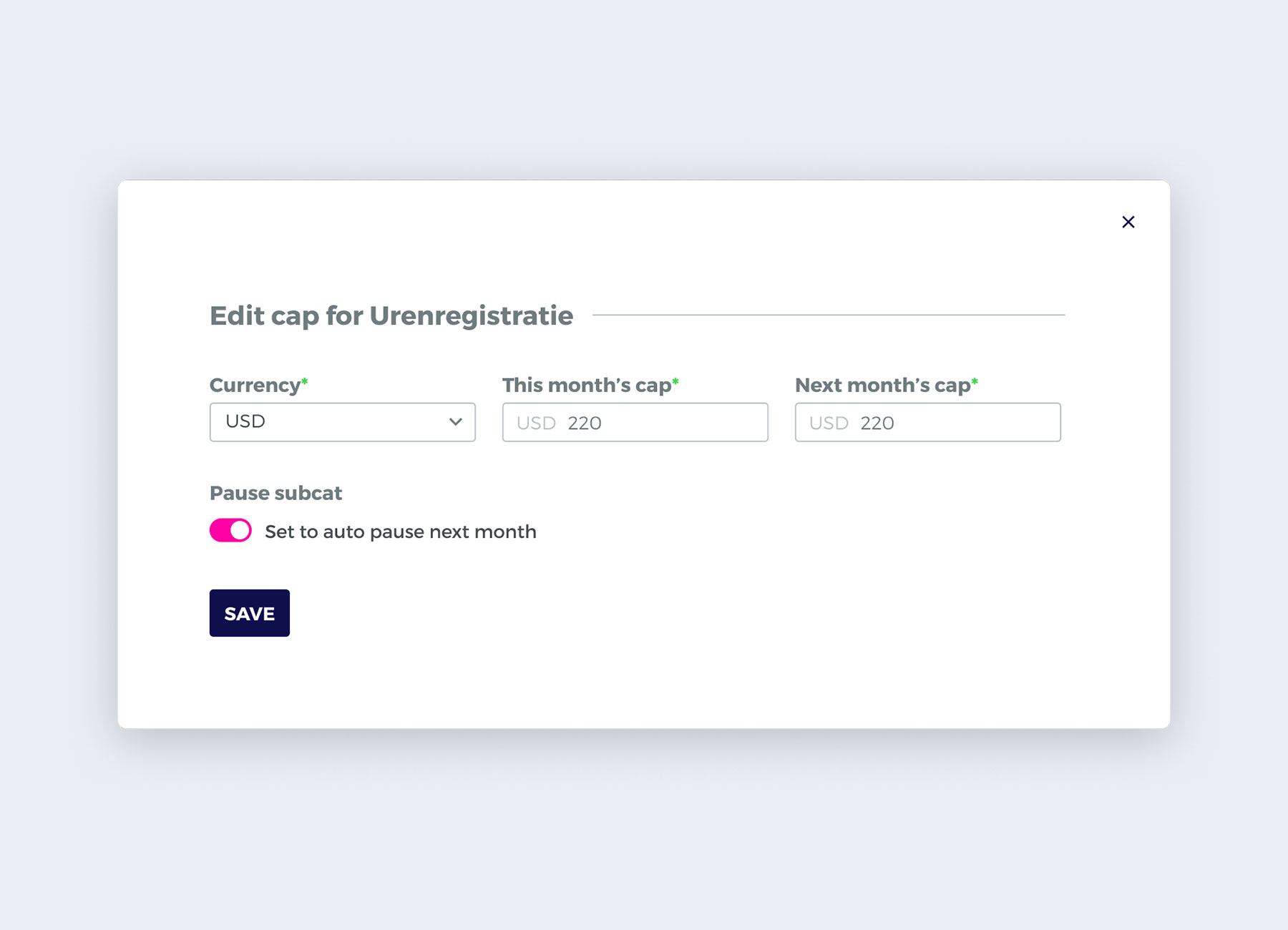
Regular user feedback collected by the Product Manager informs what features need building. This comes from internal client or partner managers, the sales team, finance or even clients and partners themselves. One such feature came from a client need to advertise in multiple territories, but be invoiced in USD only regardless of the country the ads were published in. In addition, we had to ensure that clicks were being billed to the right country under that currency. Previously, we had created a feature to assign a client multiple billing currencies, now we needed to be able to assign any country to any currency, and allow multiple countries under one currency.
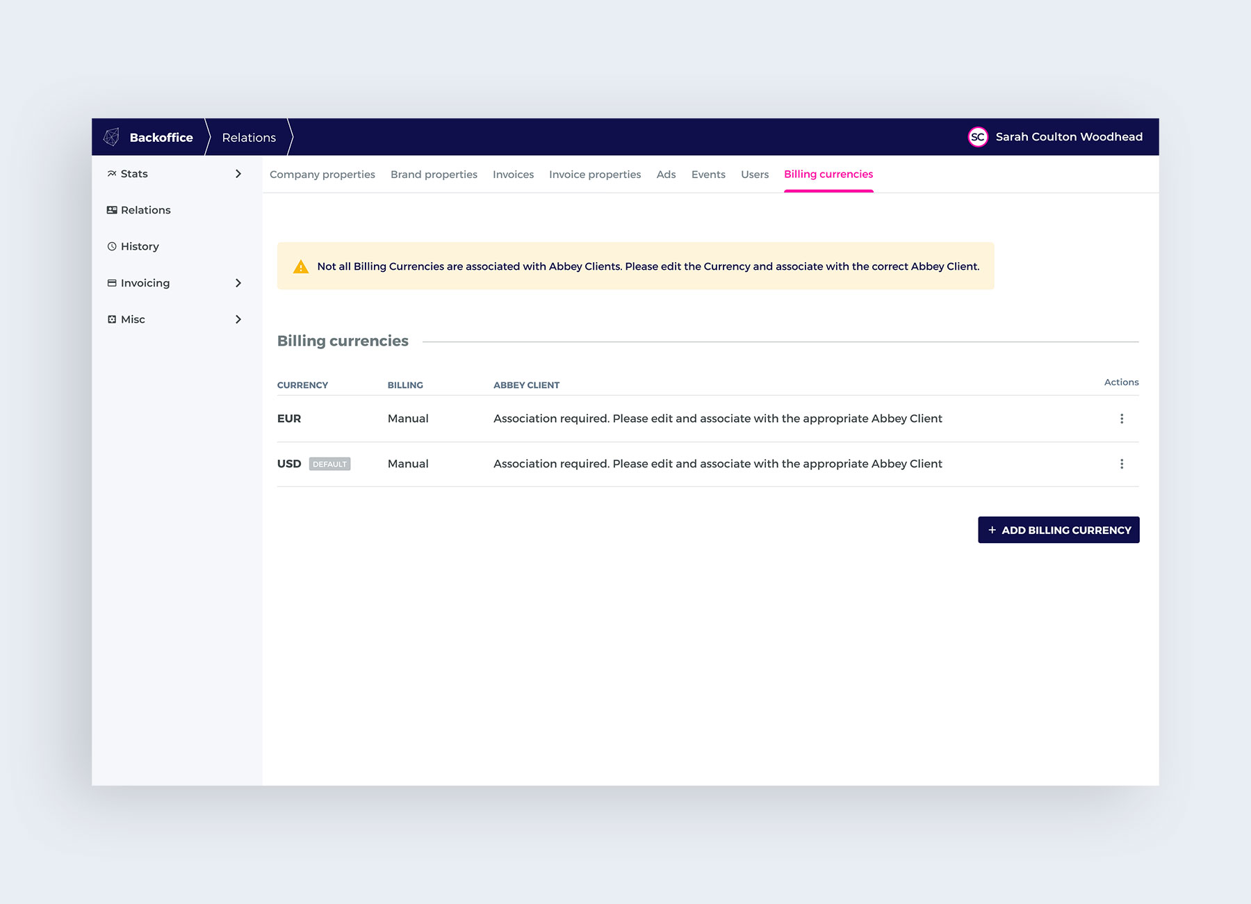
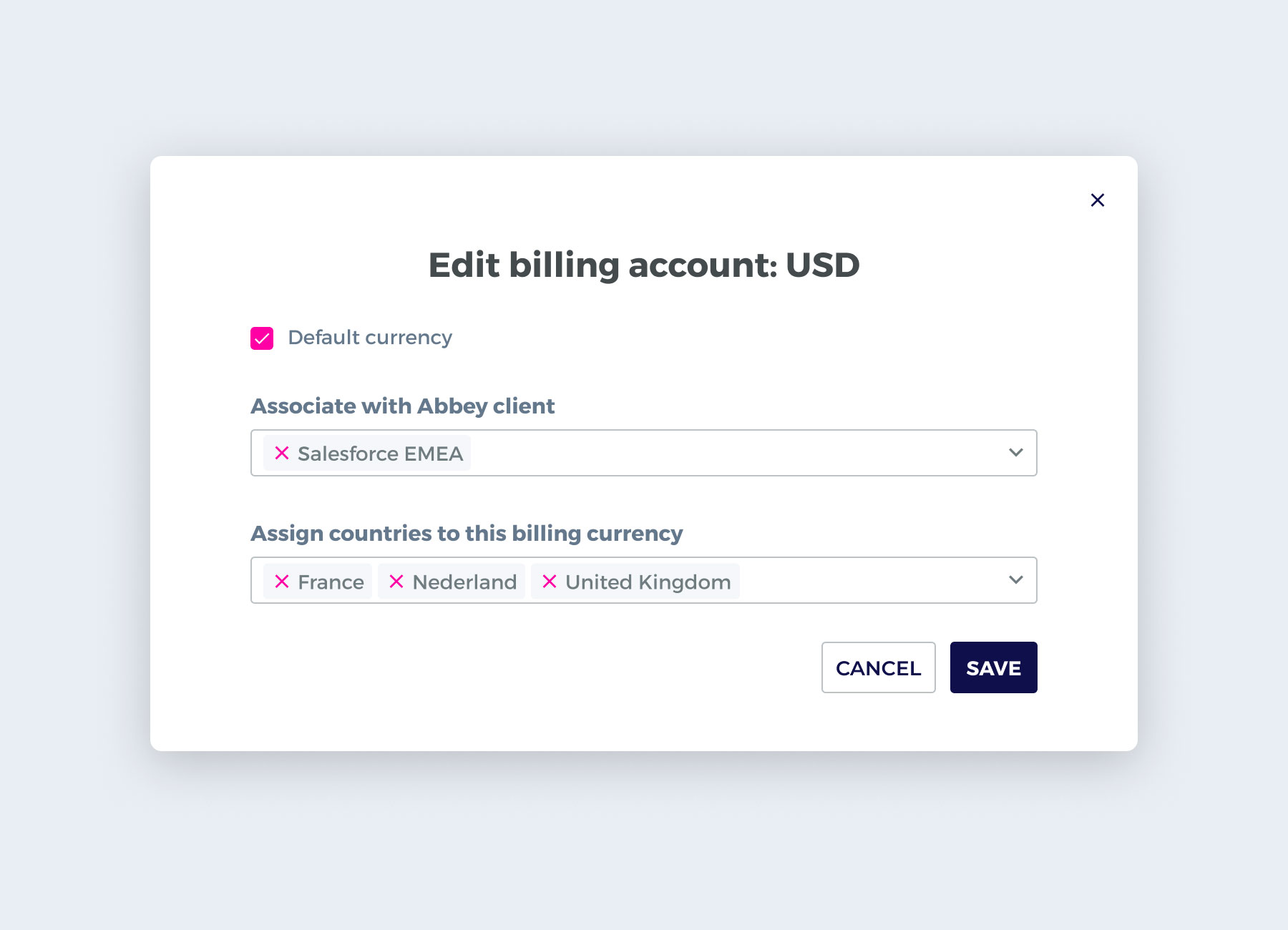
I started in the 'edit currency' modal and added a field to assign separate countries to the selected currency, using an existing react select component with the ability to turn multiple selections into tags. But this wasn't enough – how do I ensure the right clicks are being billed to the right country, if a currency is now allowed in multiple countries?
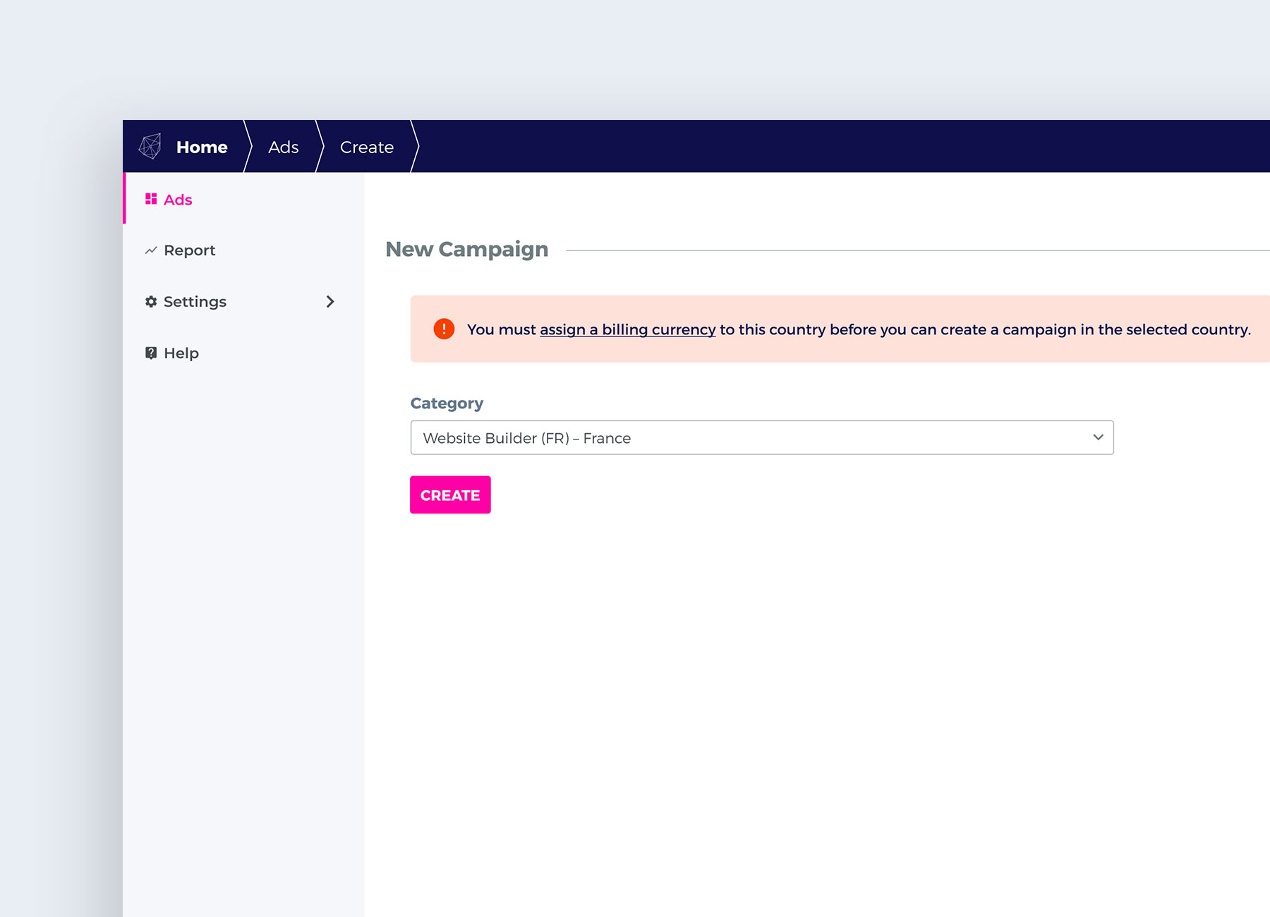
I addressed this in the 'New Campaign' screen, by ensuring countries were assigned to billing currencies, before users were able to create ad campaigns in their selected country. I added the error message "You must assign a billing account to this country before you can create a campaign in the selected country." with a text link to take them to the billing currency screen to continue. I worked this into a quick prototype and sent it to stakeholders for review.
The stakeholders were pleased with the UI solutions, but another requirement had surfaced.
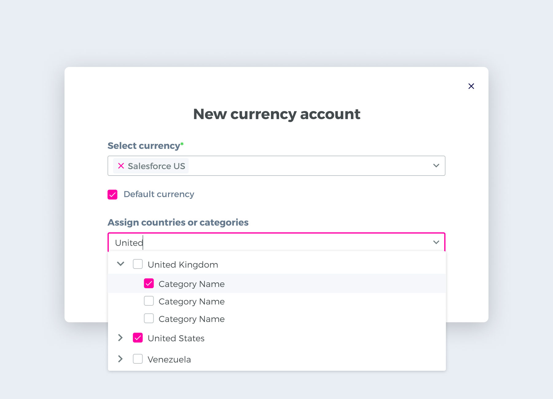
One client in particular had the requirement to assign currencies at a more granular level – by category (vertical + country) – than just by country. I had to find a way for users to select multiple categories within any country. My first thought was that the select dropdown had to contain nested lists of categories within countries, so I googled 'nested checkboxes' to find common design patterns for this kind of multi selection. But this wasn't enough – it needed to be a nested set of checkboxes within a select dropdown. I eventually found a react component that was just what I needed to solve this issue and designed a solution with it. The stakeholders were happy with this component and the feature was implemented.
Appwiki is an ever-evolving product and I learned a lot about internal products and software while working on it. UI designs for software that's largely internal are treated as guidance rather than rules to be strictly adhered to, so I learned to not be precious with the visual details. I also learned that how internal systems work and connect to each other is complex and if I don't fully understand the task requirements from the start, I can ask questions and start working on something until the pieces fall into place.