Appley is a UK based real estate company targeting out performance through asset management, planning and development strategies with a particular focus on the London area. They required a big change to their tired branding plus a whole new website to showcase their development projects.


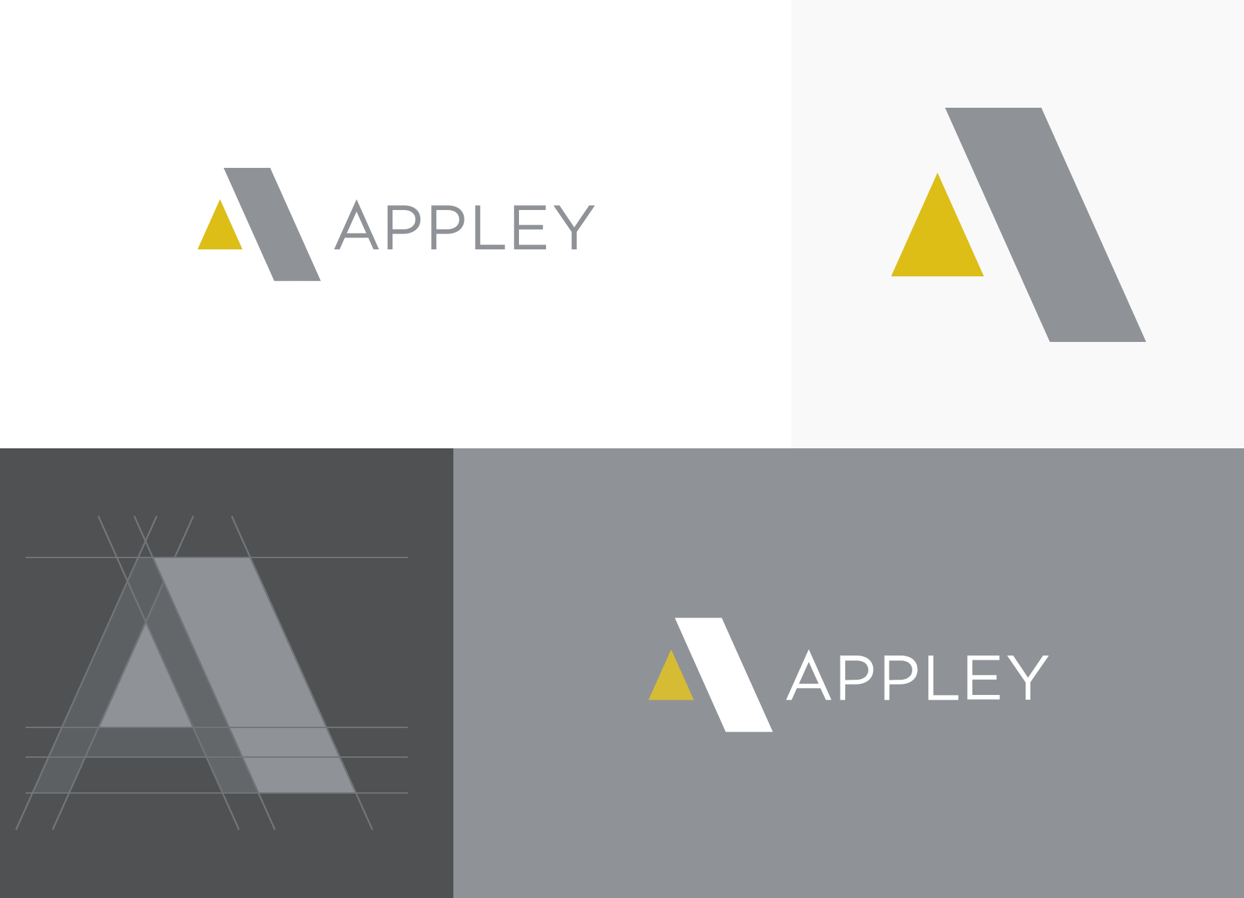
Appley needed a fresh identity to communicate their design-led approach to development. The company ensure their properties are well designed, from structures to fixtures, and the new identity needed to be as stylish as their developments. I started by looking at the architecture of the 'A' in Appley, to create a logomark with clean lines and clever use of negative space.
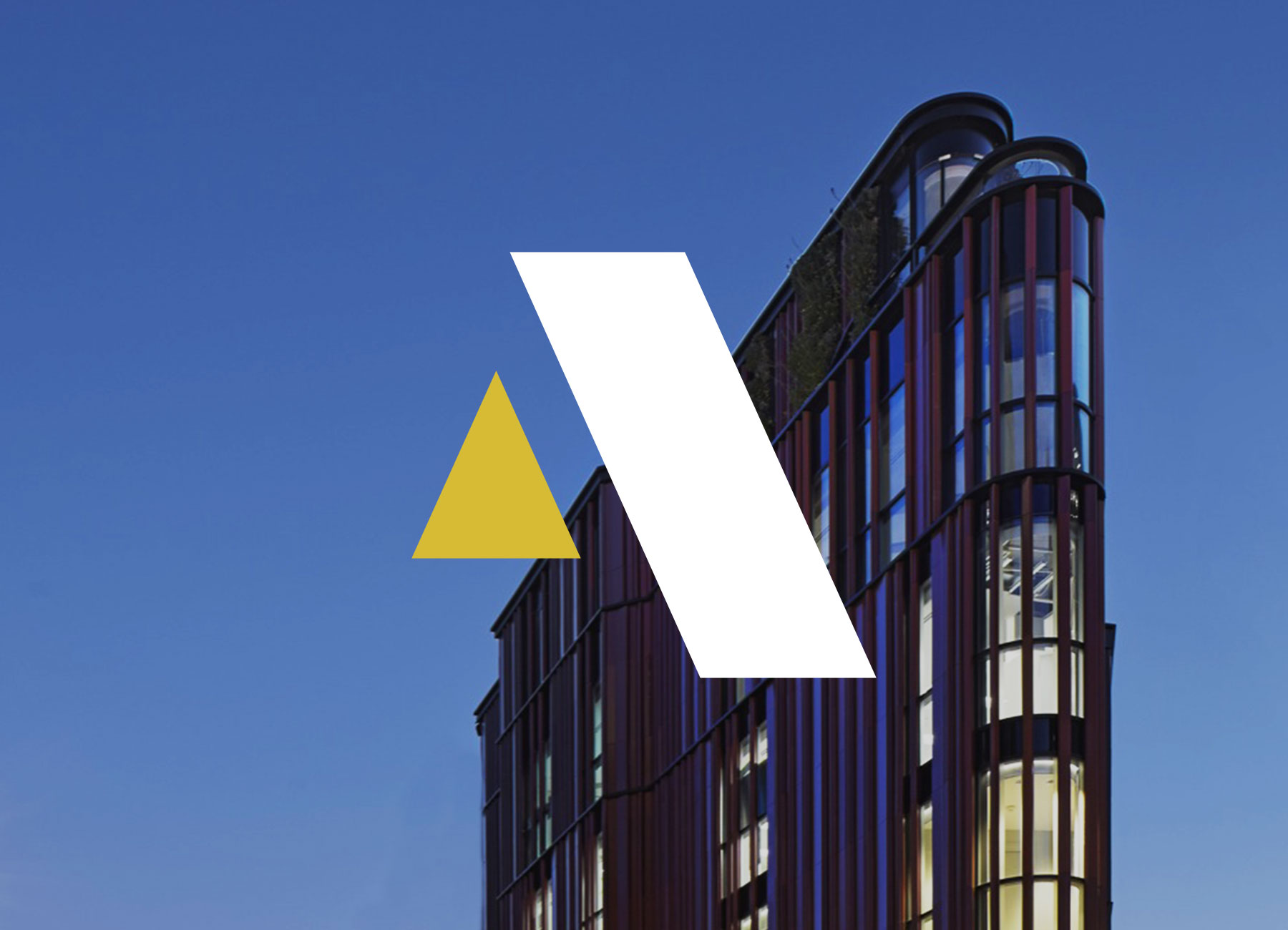
The final logo highlights the negative space of a 3D 'A' to create two balanced shapes that also work as their own verion of an 'A'.
For colours, I chose a palette of silver, gold and white – a nod to quality building materials Appley use, while providing contrast and style to the identity.
With new branding in place the next task was to design the website. The focus of the website was to showcase Appley's portfolio of development projects, plus discuss how they work. The client wanted it to be stylish with big imagery and so I created a design that was simple with clean lines and big type. I created a repeatable pattern, inspired by the angles of the logomark, to add texture to specific areas of the website.
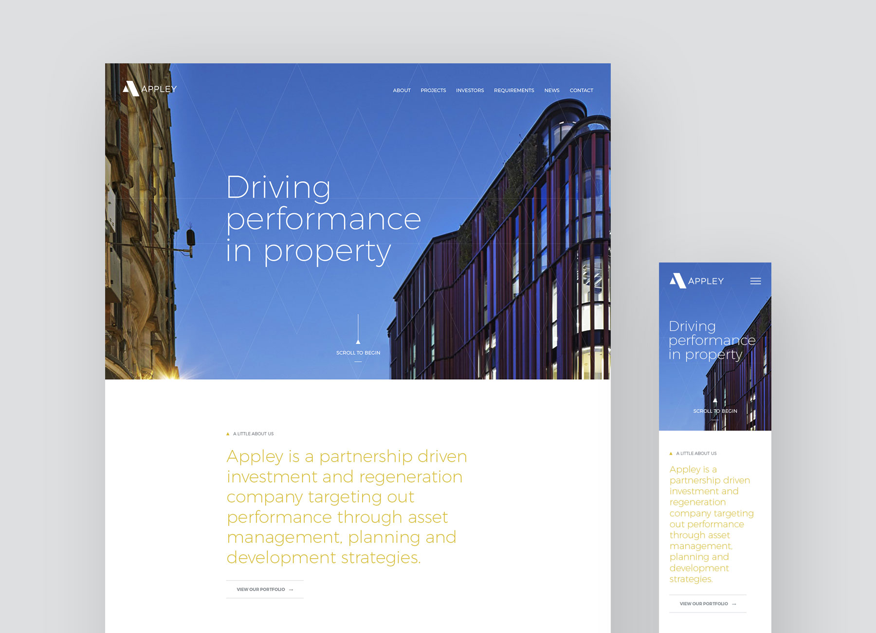
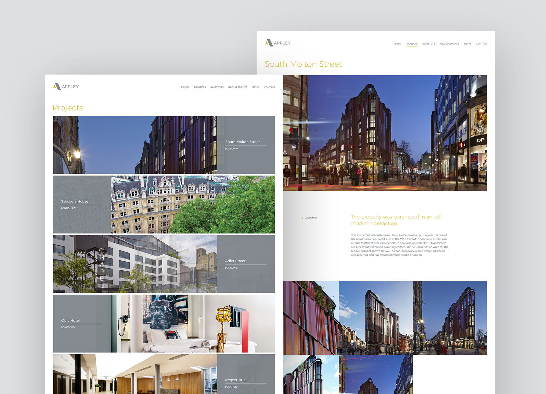
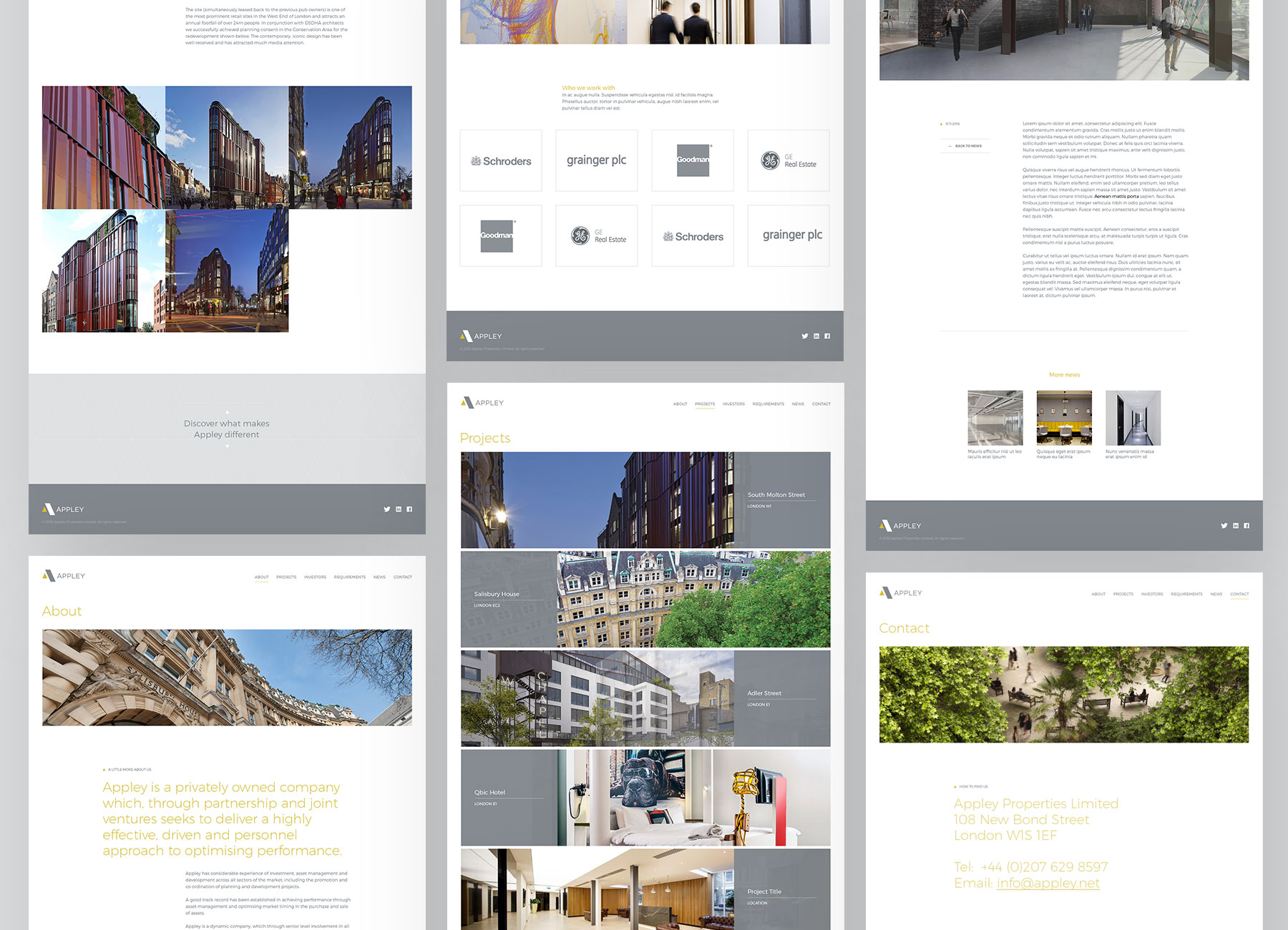
I worked closely with the developer to design parts of the site that required special functionality such as the portfolio section. As it was a bespoke design and build using Wordpress, regular chats with the devloper about design ideas, plus my ability to make frontend tweaks in HTML and CSS, ensured a smooth development phase. I created designs for desktop and mobile, and worked with the developer to adjust the layout for other breakpoints.